


In the realm of machine learning classification, model evaluation is an essential step to assess the performance and effectiveness of various algorithms. One widely-used tool for this purpose is the Area Under the Receiver Operating Characteristic Curve (AUC-ROC curve). In this blog, we will delve into the significance of the AUC-ROC curve, how it is calculated, and why it is an invaluable metric for evaluating classification models.
In this article, we will discuss the performance metrics used in the classification and also explore the implications of using two, namely AUC and ROC. Here is an overview of the important points that we will discuss in the article.
Performance Metrics for Classification
Selecting appropriate metrics for assessing a machine learning model holds significant sway. The metrics of choice wield influence over the yardstick against which machine learning algorithms’ efficacy is gauged and juxtaposed. It’s important to note that metrics diverge somewhat from loss functions. While loss functions aim to encapsulate a gauge of the model’s effectiveness and are employed in molding a machine learning model, often leveraging optimization techniques like Gradient Descent, they remain discernible within the model’s parameters. Metrics, in contrast, serve the purpose of overseeing and appraising a model’s performance during both training and testing, without necessitating differentiation. Moreover, the metrics entirely steer the significance bestowed upon distinct attributes within the outcomes.
Confusion Matrix
An essential yardstick in the realm of classification metrics is the Confusion Matrix. Visualized as a table, this matrix elucidates the interplay between actual truth labels and the prognostications of the model. Each row within the matrix encapsulates instances belonging to a forecasted class, while each column embodies instances from an authentic class. While not a standalone performance metric, the Confusion Matrix furnishes a foundational substrate upon which other gauges of efficacy can be assessed. This matrix is stratified into four distinct classes. The True Positive component quantifies the accurate predictions of positive class samples by the model. Conversely, the True Negative facet signifies the precise identification of negative class samples. The False Positive facet denotes the erroneous anticipation of negative class samples, with the inverse holding true for False Negatives.
Precision-Recall and F1 Score
Precision-recall and F1 scores emerge as metrics that derive their values from the Confusion Matrix, their essence rooted in true and false classifications. The recall, also known as the true positive rate or sensitivity, stands as a measure of how effectively the model captures positive instances. Meanwhile, precision, akin to the positive predictive value, gauges the accuracy of positive predictions within the classification context.
Accuracy Score
Accuracy shows how often the model gets things right compared to all the things, it’s trying to predict. It gives us a sense of how reliable the model’s predictions are. Considering accuracy along with other evaluation methods helps us understand the model’s performance better and learn more from it.
Formulae
Precision = True Positives / (True Positives + False Positives)
Recall = True Positives / (True Positives + False Negatives)
F1 Score = 2 * (Precision * Recall) / (Precision + Recall)
Accuracy = (True Positives + True Negatives) / Total Predictions
What is a ROC
The receiver operating characteristic curve, is a metric used to measure the performance of a classification model. The Receiver Operating Characteristic (ROC) is a fundamental graphical tool in machine learning evaluation. It depicts the performance of binary classification models by showcasing the trade-off between true positive rate (sensitivity) and false positive rate (1-specificity) across various classification thresholds. The ROC curve’s diagonal represents random guessing, while a curve above it indicates better-than-random performance. The Area Under the ROC Curve (AUC-ROC) condenses the curve’s information into a single value. Ranging from 0.5 (random) to 1 (perfect classification). This metric is robust to class imbalance and threshold choices, making it invaluable for comparing and selecting models across various applications.
What is a AUC
AUC stands for “Area Under the Curve,” and it’s used to evaluate the performance of classification models, particularly in ML. It’s to measure how well a model is able to distinguish between different classes in a binary classification problem. The AUC value is often used in the context of a Receiver Operating Characteristic (ROC) curve.
AUC Calculation: The AUC is the measure of the area under the ROC curve. It ranges between 0 and 1. An AUC value of 0.5 indicates that the model’s performance is similar to random guessing. While an AUC value of 1 indicates perfect performance where the model has perfect discrimination between the classes.
Interpretation: Higher AUC values generally indicate better model performance. If the AUC value is close to 1, it suggests that the model has a strong ability to differentiate between positive and negative samples. If the AUC value is lower, the model might be struggling to distinguish between the classes.
Decoding the Significance of AUC-ROC
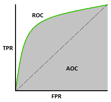
The AUC-ROC metric serves as an essential tool for evaluating classification model performance. It offers a clear insight into a model’s capability to differentiate between various classes. The evaluation criterion is straightforward: the higher the AUC, the more proficient the model’s performance. The AUC-ROC curves serve as a visual representation, effectively portraying the trade-off between sensitivity and specificity.
Each conceivable threshold is ongoing tests or test combinations. The area beneath the ROC curve provides a measure of the advantages linked to utilizing the test for the core inquiry at hand. AUC-ROC quantifies the performance of classification tasks across different threshold configurations. It offers a standardized way to gauge how well a model is doing, regardless of the specific decision thresholds being used. The AUC-ROC curve associated with a test can also function as a yardstick to assess the test’s ability to discriminate. It provides valuable insights into how effectively the test performs in a specific clinical scenario. The proximity of the AUC-ROC curve to the upper left corner of the graph signifies the test’s enhanced efficiency.
Generating AUC-ROC Curve Using Python
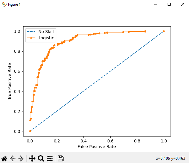
The shape of the curve contains a lot of information, including what interests us most about an issue, the expected rate of false positives, and the rate of false negatives. We can plot a ROC curve for a model in Python using the roc_curve() scikit-learn function.
# roc curve and auc
from sklearn.datasets import make_classification
from sklearn.linear_model import LogisticRegression
from sklearn.model_selection import train_test_split
from sklearn.metrics import roc_curve
from sklearn.metrics import roc_auc_score
from matplotlib import pyplot
# generate 2 class dataset
X, y = make_classification(n_samples=1000, n_classes=2, random_state=1)
# split into train/test sets
trainX, testX, trainy, testy = train_test_split(X, y, test_size=0.5, random_state=2)
# generate a no skill prediction (majority class)
ns_probs = [0 for _ in range(len(testy))]
# fit a model
model = LogisticRegression(solver='lbfgs')
model.fit(trainX, trainy)
# predict probabilities
lr_probs = model.predict_proba(testX)
# keep probabilities for the positive outcome only
lr_probs = lr_probs[:, 1]
# calculate scores
ns_auc = roc_auc_score(testy, ns_probs)
lr_auc = roc_auc_score(testy, lr_probs)
# summarize scores
print('No Skill: ROC AUC=%.3f' % (ns_auc))
print('Logistic: ROC AUC=%.3f' % (lr_auc))
# calculate roc curves
ns_fpr, ns_tpr, _ = roc_curve(testy, ns_probs)
lr_fpr, lr_tpr, _ = roc_curve(testy, lr_probs)
# plot the roc curve for the model
pyplot.plot(ns_fpr, ns_tpr, linestyle='--', label='No Skill')
pyplot.plot(lr_fpr, lr_tpr, marker='.', label='Logistic')
# axis labels
pyplot.xlabel('False Positive Rate')
pyplot.ylabel('True Positive Rate')
# show the legend
pyplot.legend()
# show the plot
pyplot.show()
Conclusion
In conclusion, this article delved into the essence of Performance Metrics, shedding light on their significance. The focus remained on a specific classification metric, namely the AUC-ROC curve. Through a straightforward Python illustration, we grasped not only its implementation but also the rationale behind its adoption. As we wrap up, I extend an invitation to readers to embark on a deeper exploration of this pivotal subject, recognizing its indispensability in the realm of crafting effective classification models.
1 thought on “Exploring the AUC-ROC Curve in Machine Learning Classification”
Pingback: Exploring the Area under the ROC Curve – Curated SQL