


This image is created by Copilot
In an era where technology explodes and the Internet of Things (IoT) spreads everywhere, we witness the emergence of a series of products, from tangible to intangible, each imprinted with the remarkable progress of the human mind. People. This has pushed the software industry and electronics technology to become two fields that are not only closely linked but also take the lead in the race to develop modern technology. Therefore, the core qualities of software – from accuracy, stability and usefulness, to completeness, security and performance – need to be enhanced and guaranteed, not only for a unique product like bespoke shoes but also for a whole range of other products.
1. Responsive Design Testing
 Responsive Design Testing, also known as Responsive Testing, is a crucial component of Usability Testing within the realm of software quality assurance. It ensures that websites are adept at adapting to various device sizes and maintaining design integrity across platforms.
Here’s how responsive design testing elevates the digital experience:
- Optimizes User Experience: A consistent and fluid user interface is what customers anticipate, irrespective of their chosen device. Through meticulous testing, we pinpoint and rectify any elements that could hinder a user’s interaction with the website.
- Boosts SEO Rankings: With search engines prioritizing sites that are optimized for mobile use, responsive testing is key to climbing the SEO ladder.
- Expands Audience Reach: By catering to users on all devices, a responsive site broadens its audience, fostering greater engagement and opening the door to increased conversion opportunities.

2. Objectives of Responsive Testing
The primary aim of Responsive Testing is to enhance the user experience across a spectrum of devices—be it mobile phones, desktops, or laptops—each with its unique screen dimensions, display modes, and resolutions. This testing ensures that a website intuitively conforms and adjusts to the specific conditions of the user’s device, all while preserving full functionality.
Responsive Testing strategically targets key areas:
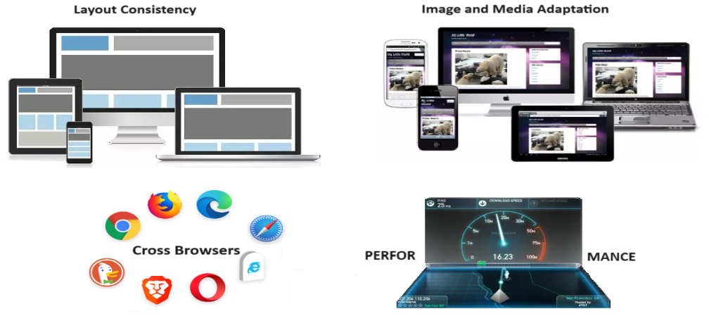
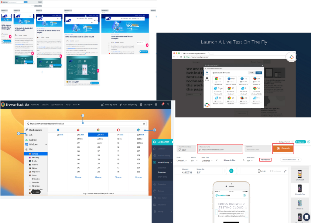
- Uniformity in Design: Testers are tasked with confirming that the website’s layout remains consistent, regardless of screen size. This includes preserving the original design’s orientation and structure, whether it’s vertical or horizontal, and ensuring content and images are arranged as intended.
- Adaptive Media: It’s imperative that images and multimedia elements automatically resize and align correctly, matching the dimensions of the user’s device.
- Seamless Navigation: The website’s navigation menus and interactive elements should remain constant and easily operable, providing a user-friendly experience on any device.
- Browser Harmony: Ensuring that the website’s design delivers a uniform experience across various web browsers is essential for user satisfaction.
- Performance Optimization: Lastly, responsive design testing is vital for guaranteeing swift load times and efficient performance across diverse devices.
3. Principles of Responsive Testing

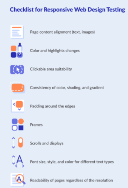
- Text Alignment: Ensure images, text, and multimedia are automatically aligned as per the design.
- Clickable Zones: Pay special attention to interactive areas that must adapt to different sizes.
- Padding: Check for correct padding across all boundaries.
- Fonts: Ensure font size, style, and color are consistently maintained across the website/application.
- Scrolling: Provide flexible scrolling for end-users.
- Navigation: Simplify navigation between internal web pages.
- Boundaries: Ensure text, images, and frames stay within boundaries.
- Menu: Design navigation menus to be compatible with various devices.
4. How to Conduct Responsive Design Testing?
There are several tools and techniques available for conducting responsive design testing that software testers or project managers can choose from:
4.1 Manual Approach:
- Physical Device Testing

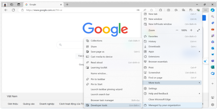
- Browser Developer Tools: Tools are attached to each web browser such as Firefox Developer Tools, Chrome Developer Tools, Microsoft Edge Developer Tools,…
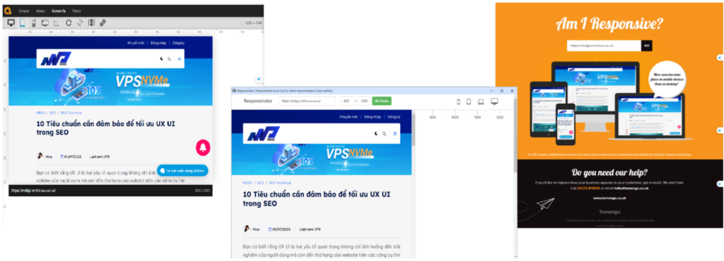
- Online Testing Platforms: Some online tools for responsive design testing include Responsinator, Am I Responsive?, Screenfly, …
- Viewport Resizers:
- Responsive Viewport Resizer: A browser extension for resizing the viewport to test responsiveness.
- Window Resizer: Another browser extension for resizing the browser window to simulate different device viewports.
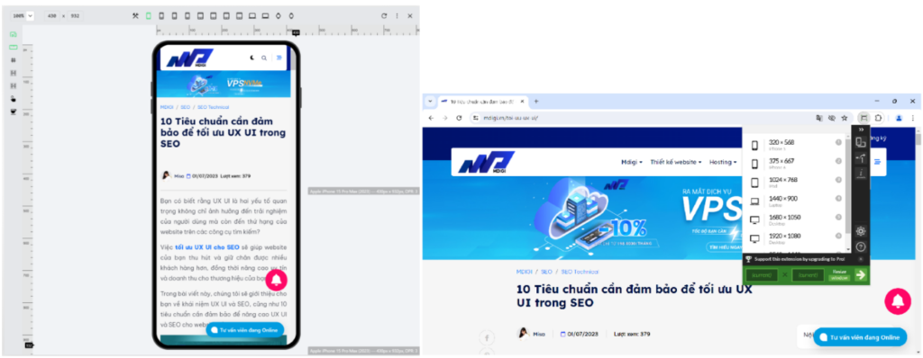
- Device Emulators:
- BrowserStack: An online service offering real device and simulator utilization for cross-browser and cross-device website and application testing
- CrossBrowserTesting: Offers real-time testing on real devices and virtual environments for testing responsiveness across various browsers, devices, and resolutions.
4.2 Automated Approach:

Cypress: Although primarily an end-to-end testing framework, Cypress can also be used for responsive design testing by automating browser interactions and viewport changes.
 Puppeteer: A Node.js library providing a high-level API to control Chrome or Chromium. Puppeteer can be used for automating responsive design testing.
5. Best practices for effective testing
- Adopt a Mobile-First Strategy: Design for the smallest screen first and scale up. This ensures the design is inherently responsive.
- Prioritize Content: Ensure the most important information is easily accessible on all devices.
- Continuous Testing: Integrate testing throughout the development process to detect and resolve issues early.
- Regular Updates: Keep up with new devices and screen sizes to ensure ongoing compatibility.
REFERENCE LINKS
- Launch your BrowserStack Live session | BrowserStack Docs
- 9 of the Best Responsive Website Design Testing Tools and Sites (elegantthemes.com)
- https://chromewebstore.google.com/detail/crossbrowsertesting-go/oapindodkkndonmflelpddkehnocnenh
- XRespond – Virtual Device Lab (xrespond-upleveled.netlify.app)
- Responsive Web Design Testing: Definitive Guide | QAwerk
- Most of the images in this blog are collected from Internet