


In today’s data-driven world, the ability to visualize and interpret data is crucial. Microsoft’s Power BI is a powerful tool that allows you to transform raw data into meaningful insights. The Power BI Service, in particular, provides a cloud-based platform for sharing and collaborating on interactive reports and dashboards. In this guide, we will walk you through the steps to build your first dashboard in Power BI Service.
What is Power BI Service?
Power BI Service is an online software-as-a-service (SaaS) platform provided by Microsoft. It allows users to create, share, and collaborate on reports and dashboards. Unlike Power BI Desktop, which is a standalone application, Power BI Service is cloud-based, enabling easy access and sharing of your data insights from anywhere, at any time.
Getting Started
Before you begin, make sure you have:
- A Power BI account (you can sign up for a free account or use your organization’s credentials if they have a Power BI subscription).
- Access to the data you want to visualize. This can be in various formats such as Excel, CSV, or connected to a database.
Step-by-Step Guide to Building Your First Dashboard in PowerBI Web
Step 1: Sign In to Power BI Service
Go to the Power BI website (https://powerbi.microsoft.com/) and sign in with your credentials. Once logged in, you will be directed to the Power BI Service homepage.
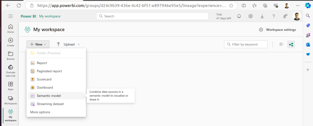
Step 2: Upload Your Data
- Click on the “Workspaces” tab on the left sidebar and select “My Workspace.”
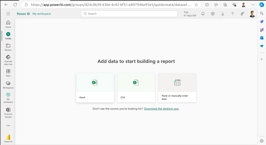
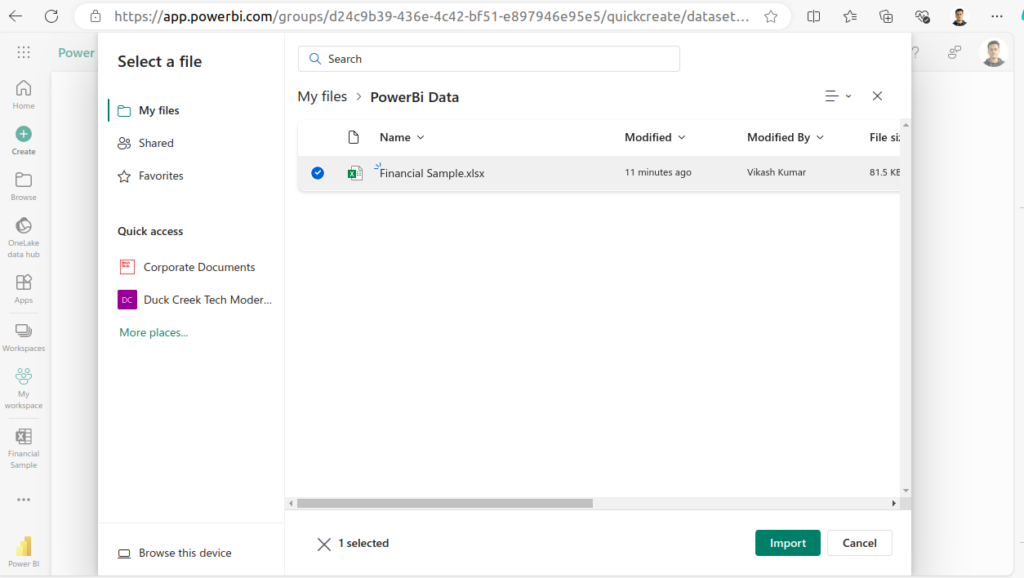
- Click on the “New” button and select “Semantic model” and then choose your data file (Excel, CSV, etc.).
- Once the model is created, you will be able to see this in your workspace.
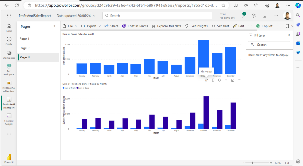
Step 3: Create a Report
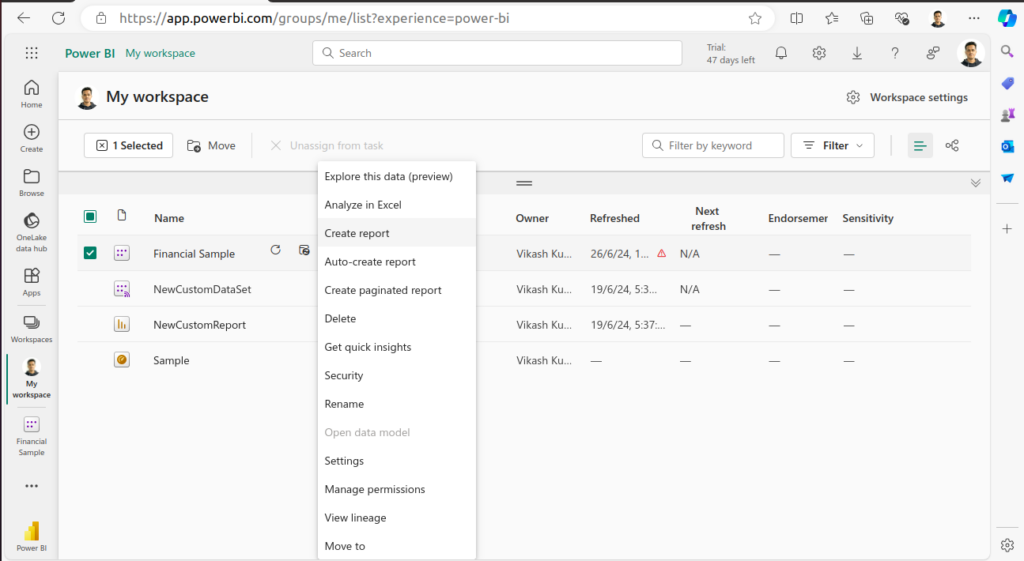
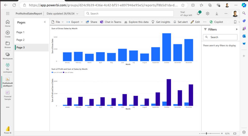
- Go to “My Workspace” and select the dataset you just uploaded.
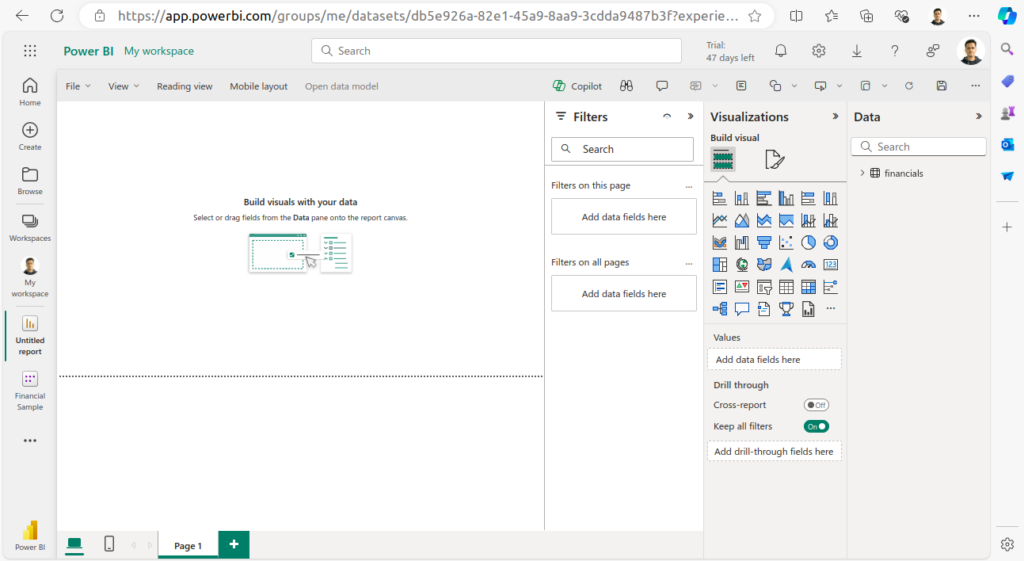
- Click on the “Create Report” button. This will open the report editor.
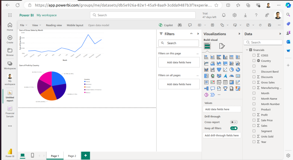
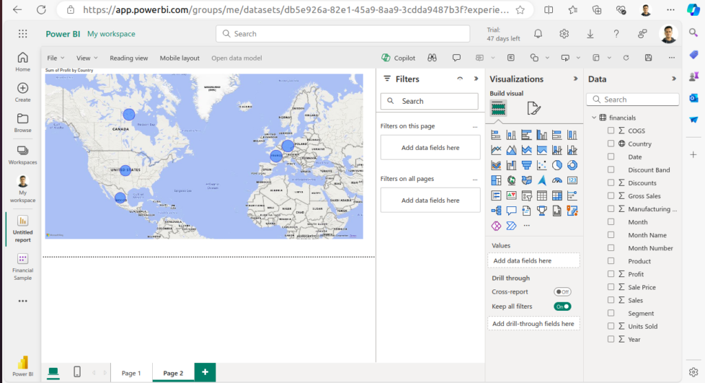
- In the report editor, you can drag and drop fields from your dataset onto the canvas to create various visualizations such as charts, tables, and maps.
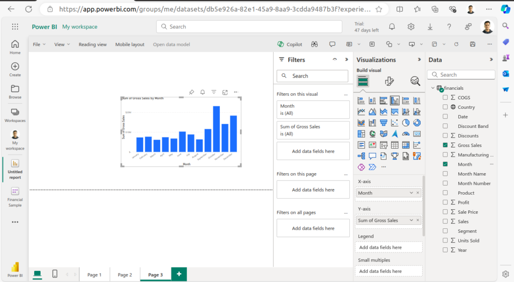
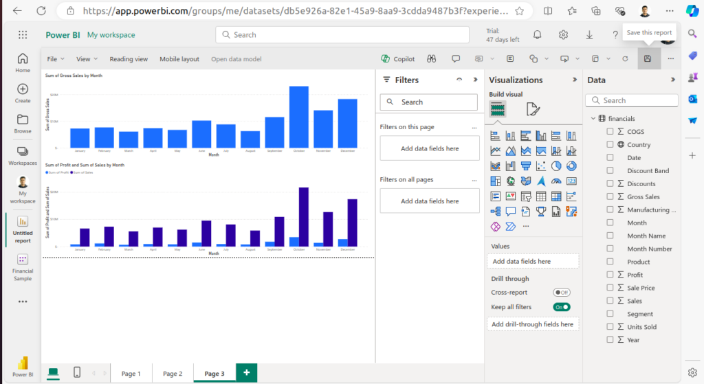
Step 4: Design Your Report
- Use the visualization pane to choose the type of visualization you want to create.
- Customize your visualizations by adjusting colors, labels, and other settings in the format pane.
- Add multiple visualizations to the canvas to create a comprehensive report. You can resize and rearrange these visualizations to fit your design.
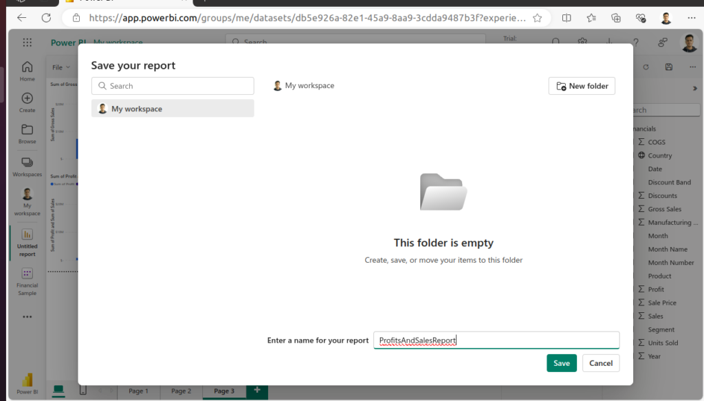
Step 5: Save Your Report
- Once you are satisfied with your report, click on the “Save” button.
- Give your report a meaningful name and save it in “My Workspace.”
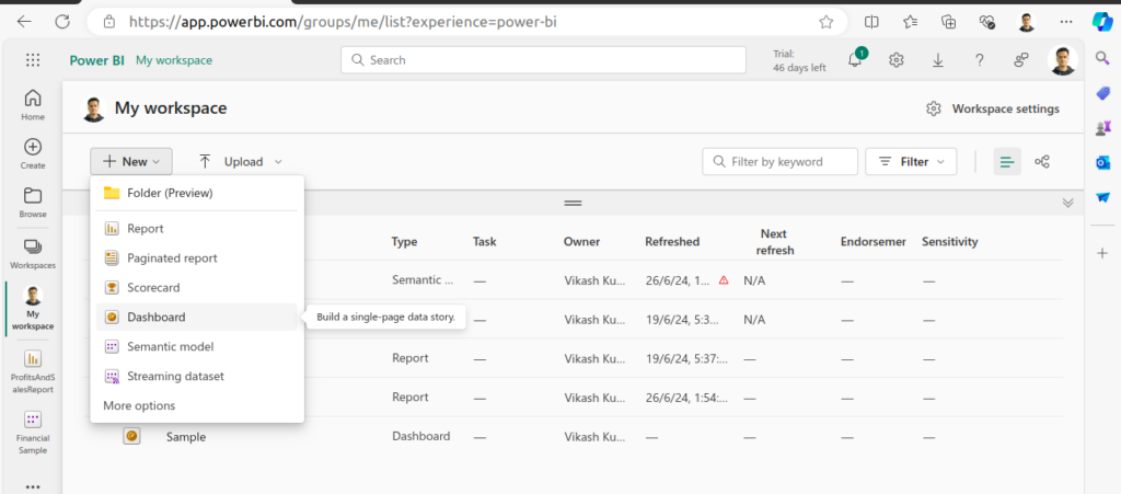
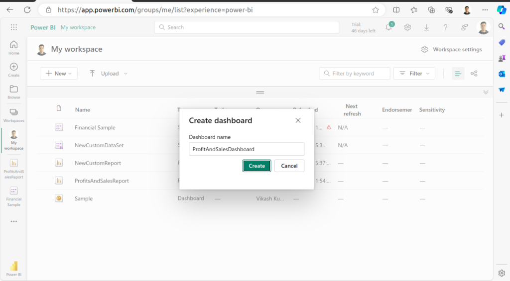
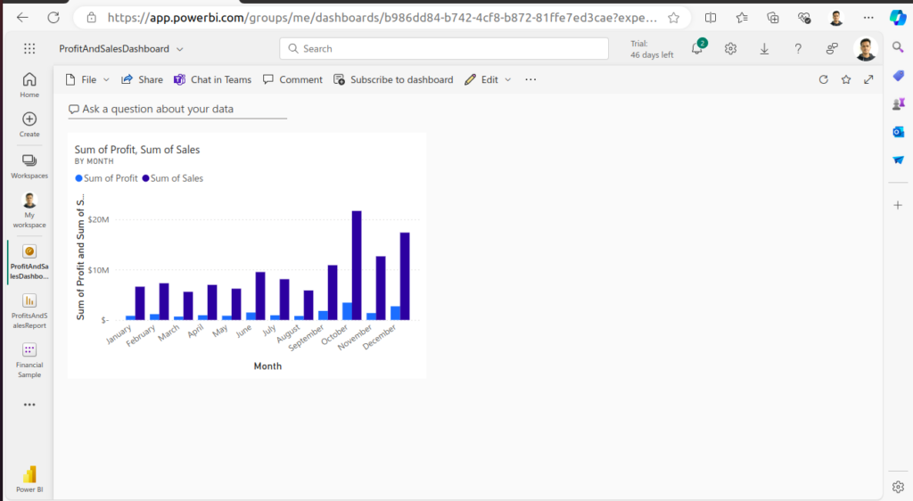
Step 6: Create a Dashboard
- Go to “My Workspace” and click on the “New” button, then select “Dashboard.”
- Name your dashboard and click “Create.”
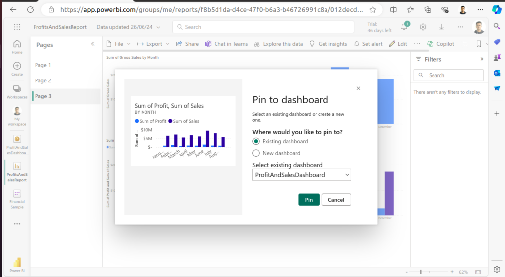
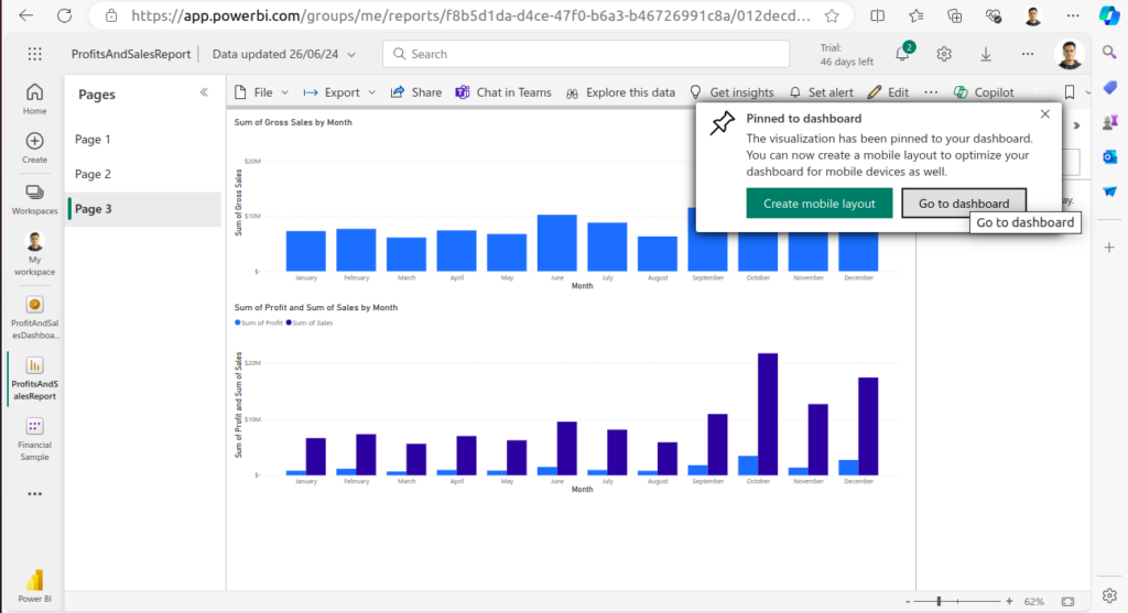
- To add visualizations from your report to the dashboard, go back to your report, click on the pin icon on each visualization, and select the dashboard you just created.
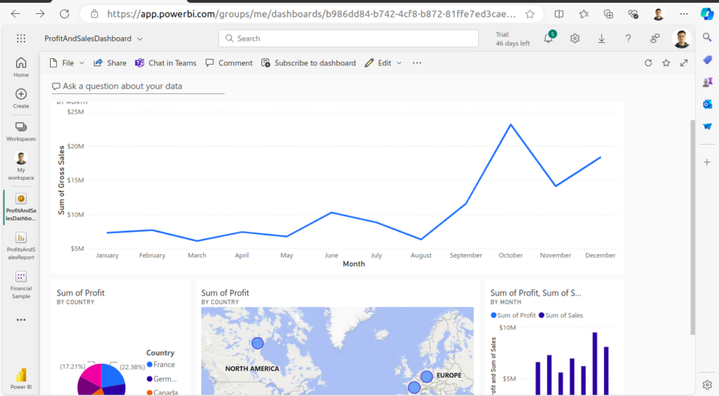
Step 7: Customize Your Dashboard
- In the dashboard view, you can rearrange and resize the visualizations by dragging the corners.
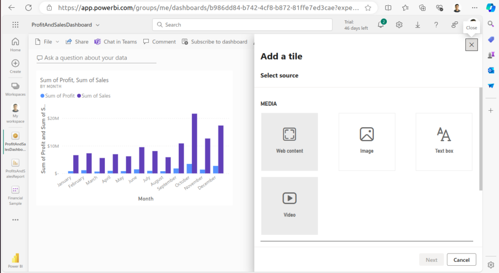
- You can also add tiles such as text boxes, images, or web content to enhance your dashboard.
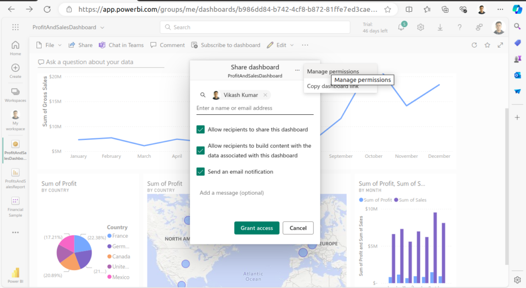
Step 8: Share Your Dashboard
- Click on the “Share” button at the top of the dashboard.
- Enter the email addresses of the people you want to share the dashboard with. You can also generate a shareable link.
- Set the appropriate permissions and click “Share.”
Tips for Building an Effective Dashboard
- Keep it Simple: Avoid clutter by focusing on key metrics and visualizations that convey the most important insights.
- Use Clear Titles and Labels: Ensure that each visualization is clearly labeled so users can easily understand the data.
- Consistency is Key: Use consistent colors and styles across all visualizations to create a cohesive look.
- Interactive Elements: Leverage Power BI’s interactive features such as filters and slicers to allow users to explore the data.
Conclusion
Building your first dashboard in Power BI Service is an exciting step towards harnessing the power of data visualization. By following these steps, you can create insightful, interactive dashboards that can be shared and collaborated on with ease. Whether you are a business analyst, data scientist, or just a data enthusiast, Power BI Service offers a robust platform to bring your data to life.