


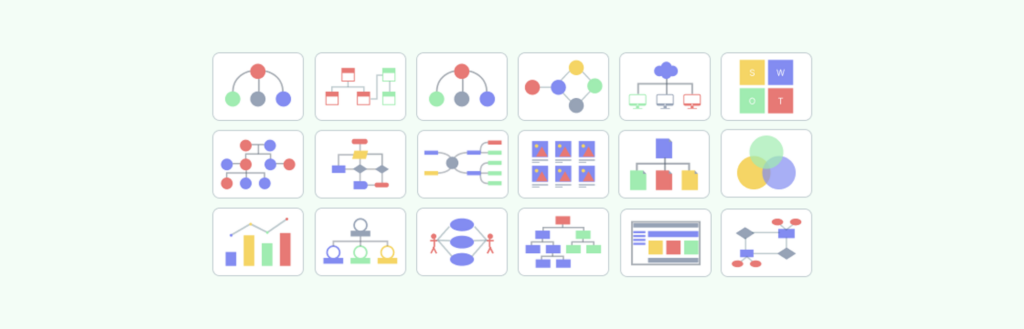
As IT Business Analysts, we act as the bridge between the technical domains and the business counterparts, converting business demands into understandable requirements that are clear and actionable to all stakeholders. However, how can you be sure that everyone’s on the same page? The answer: diagrams. Diagrams are more than just lovely images; they are necessary instruments for efficient communication in any undertaking. In IT Business Analysis, using common diagrams effectively can significantly enhance project success. Diagrams like Use Case, Sequence, and Gantt Charts are essential tools that every IT Business Analyst should master. In this blog, we are going to look at some of the most common diagrams you may come across and discover how they might assist you in bridging the aforementioned gap.
1. Use Case Diagrams: The Building Blocks of Your System
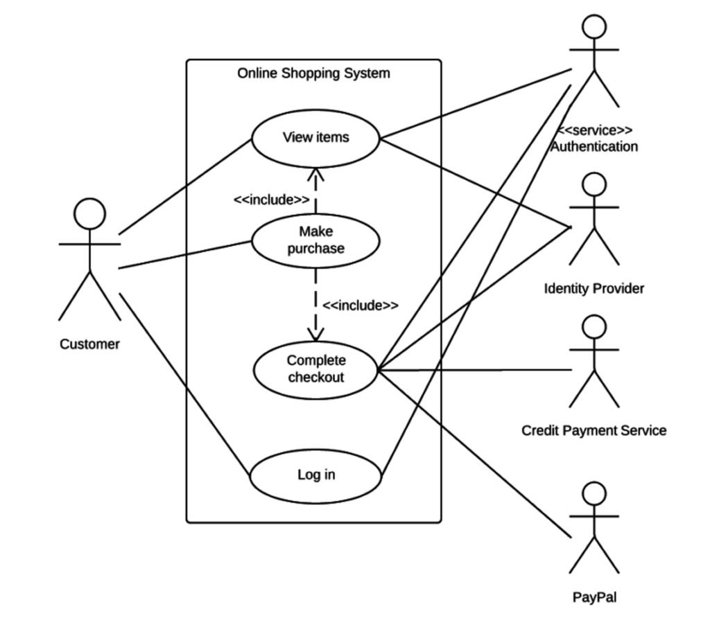
What They Are:
Use case diagrams, at their core, are simple visual representations of the various functions (or “use cases”) that users (or “actors”) can access within a system, presented from an external point of view. Consider yourself attempting to describe an app’s functions to a person who has never seen it before. You would concentrate on what the user can accomplish with the app—log in, view products, make purchases—rather than getting bogged down in technical jargon. In essence, a use case diagram accomplishes that.
When to Use Them:
In the early phases of system design, these diagrams are quite effective. They can help you define the goals of the system without getting bogged down in the specifics when gathering requirements or trying to get everyone on the same page. It’s very helpful when you have to explain things to non-technical stakeholders who could become bogged down in the minutiae of intricate diagrams.
Why They Matter:
Misunderstandings about the intended functionality of a system can result in expensive errors in any project. By guaranteeing that all parties involved—client, developer, and others—have a clear understanding of the intended functionality of the system, use case diagrams help prevent these. They’re also excellent at spotting possible edge cases, or situations that might not be immediately apparent but could cause problems if disregarded in the future. Rolland et al. (1998) found that Use Case Diagrams can help bridge the communication gap between developers and non-technical stakeholders. The study discovered that projects using Use Case Diagrams in their early phases had a 15% greater success rate in satisfying customer expectations than those that didn’t – [Journal of Systems and Software](https://www.sciencedirect.com/journal/journal-of-systems-and-software/articles-in-press#:~:text=Articles in press are peer,volumes%2Fissues of the publication.)
2. Activity Diagrams: The Flow of Work

What They Are:
Activity diagrams are similar to flowcharts, but with more muscle. They diagram the flow of activities inside a system or process, making it simpler to comprehend how distinct tasks are related and what must occur for a process to be completed properly. Consider them a visual depiction of a to-do list that demonstrates not just what has to be done, but also how everything fits together.
When to Use Them:
These diagrams are particularly effective for modeling a business process or workflow. They’re excellent at identifying bottlenecks or inefficiencies in a process, which is critical when trying to optimize operations or install new technology. If you have a complex process with several phases, decision points, and concurrent operations, an Activity Diagram can help you make sense of everything.
Why They Matter:
In today’s fast-paced corporate world, efficiency is crucial. Activity Diagrams aid in identifying places where a process may be optimized, saving time and resources. They’re also quite useful for ensuring that everyone participating in a process knows their position and how their duties fit into the larger workflow. This is especially crucial in large projects with several teams and stakeholders, because miscommunications may quickly derail progress. Van Der Aalst et al. (2004)’s study in the Business Process Management Journal emphasizes the usefulness of Activity Diagrams in process optimization. The study discovered that firms that employed Activity Diagrams to represent their processes were able to lower cycle times by an average of 20% – Aalst, W.M.P.: Business process management: a comprehensive survey
3. Data Flow Diagrams (DFD): The Arteries of Your System
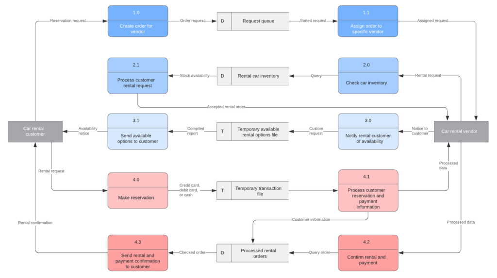
What They Are:
Data Flow Diagrams (DFDs) illustrate how data flows through your system. They describe the flow of information from input to output, including where data originates, how it is processed, and where it ends up. Consider tracing the path of a customer’s order through your system, from the moment they click “Buy” to the point when the order is shipped. A DFD allows you to visualize all of the processes required, making it easier to comprehend and optimize the process.
When to Use Them:
DFDs are critical during the system design process, especially when it comes to ensuring that data is handled appropriately. They’re especially beneficial in tasks requiring data integrity, such as financial systems or healthcare applications. Visualizing the flow of data allows you to see possible difficulties early on, before they become larger problems.
Why They Matter:
Data is the lifeblood of every contemporary system, and how it is managed may make or kill a project. DFDs assist guarantee that data flows easily and effectively across your system, lowering the likelihood of mistakes and redundancies. They also make it simpler to engage with stakeholders, who may not be familiar with technical intricacies but must understand how data will be handled. According to Yourdon and Constantine’s (1979) study published in the Journal of Database Management, employing DFDs during the design phase can minimize data processing mistakes by up to 30%. The study also showed how DFDs may assist identify and eliminate superfluous data flows, resulting in more efficient and streamlined processes. – Structured Design: Fundamentals of a Discipline of Computer Program and Systems Design
4. Entity-Relationship Diagrams (ERD): The DNA of Your Data
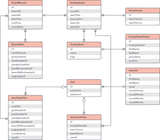
What They Are:
Entity-Relationship Diagrams (ERDs) are the primary tool for mapping out the structure of your database. They display the entities (such as “Customer” or “Product”) and the relationships between them, allowing you to see how data is arranged and interrelated. Consider an ERD to be your database’s blueprint—it provides the groundwork for everything that follows.
When to Use Them:
ERDs are essential during the database design process, whether you’re creating a new system from scratch or improving an old one. They contribute to the well-structuredness of your database and the consistency of all entity relationships. This is especially significant in complicated systems where data integrity and consistency are required.
Why They Matter:
A well-designed database is critical to the seamless running of any system, and ERDs are the key to doing it properly. By defining the relationships between things, you can guarantee that your database is normalized and devoid of abnormalities that might create difficulties in the future. This not only enhances the speed of your system, but also makes it easier to maintain and expand as your requirements change. Chen’s work (1976) examines the usefulness of ERDs in database architecture, claiming that they can minimize the risk of data anomalies by up to 25%. The research also demonstrates how ERDs might aid in detecting possible concerns with data integrity before they become serious problems – The entity-relationship model : toward a unified view of data
5. Sequence Diagrams: The Timeline for Systems
What They Are:
Sequence Diagrams are all about timing; they depict how items in a system interact across time, representing the order of events as they occur. Assume you’re trying to describe how a login process works, from the moment a user inputs their credentials until the point at which they have access to the system. A Sequence Diagram would depict each stage in the process, demonstrating how various components interact to produce the intended result.
When to Use Them:
These diagrams are very effective for detailing the flow of activities in a complicated system, particularly one with several objects interacting over time. They’re ideal for troubleshooting and modifying system behavior because they give a clear view of how components interact in real time. Sequence Diagrams are essential when working on a system that requires precise timing, such as a real-time application.
Why They Matter:
Understanding the order of events in a system is critical for ensuring that everything operates as expected. Sequence Diagrams can help you identify possible timing difficulties, such as race situations or deadlocks, before they cause problems in production. They’re also useful for describing the flow of activities to stakeholders who may be unfamiliar with the technical intricacies but must understand how the system operates. A study discovered that sequence diagrams may greatly increase stakeholders’ understanding of functional requirements, particularly among more experienced and capable participants. These findings indicate that sequence diagrams can be an effective tool for improving stakeholder knowledge and communication in software development initiatives – Assessing the Effectiveness of Sequence Diagrams in the Comprehension of Functional Requirements: Results from a Family of Five Experiments
6. Swimlane Diagrams: Keeping Your Processes Organized
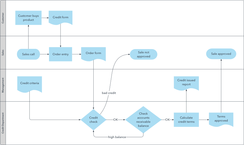
What They Are:
Swimlane Diagrams extend the notion of flowcharts by grouping actions into lanes, each representing a distinct department or stakeholder. This makes it clear who is accountable for what, ensuring that everyone understands their part in the process. Assume you’re designing a customer service process that spans numerous divisions, from sales to support. A Swimlane Diagram would depict how tasks are distributed between departments, indicating where handoffs occur and who is accountable for each step.
When to Use Them:
These diagrams are ideal for process documentation and improvement, particularly in cross-functional teams when clarity is required. They are also useful for detecting inefficiencies or locations where roles may overlap, resulting in misunderstanding or delays. If you’re working on a process with several stakeholders, a Swimlane Diagram can assist keep everyone in their lane—literally.
Why They Matter:
Miscommunication and overlaps are common in processes involving numerous teams or departments, resulting in inefficiency and mistakes. Swimlane Diagrams assist to avoid these complications by clearly outlining roles, making it easy to know who is accountable for what. This not only enhances process efficiency, but also guarantees that everyone engaged understands exactly what has to be done – Streamlined Workflow Analysis Using Swim Lanes
7. Gantt Charts: The Project Manager’s Best Friend
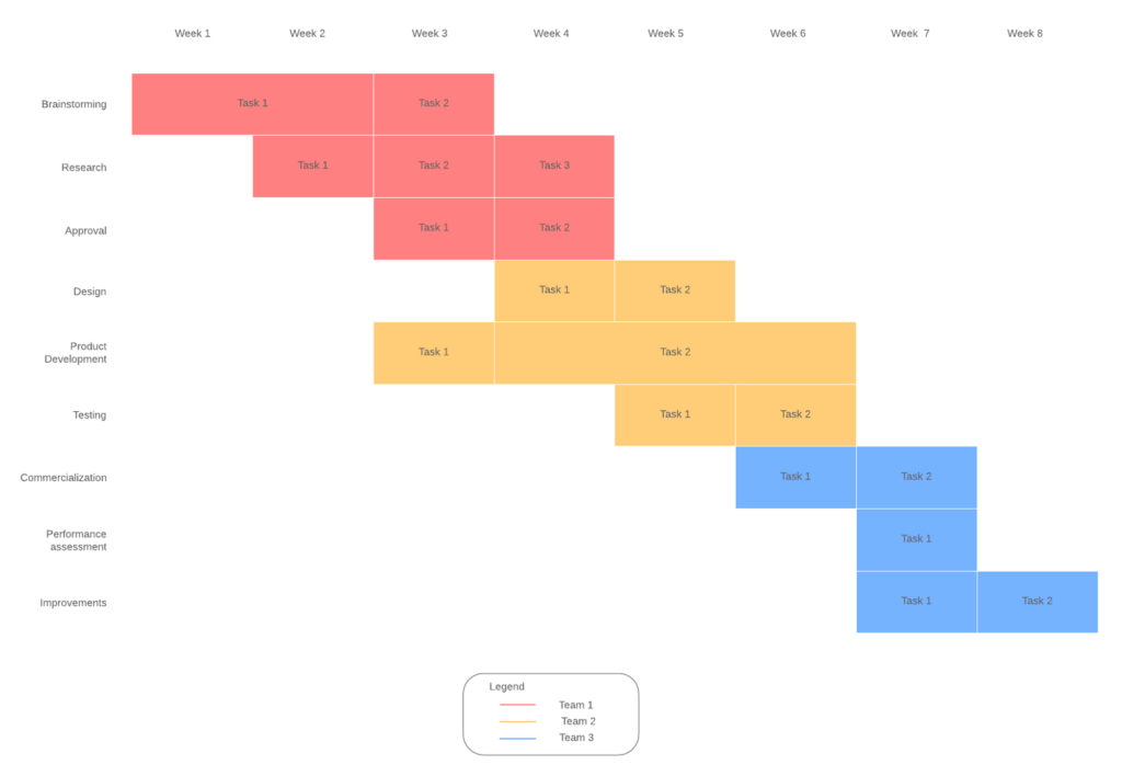
What They Are:
Gantt charts are essential tools for project management. They provide a visual timeline of your project, displaying all of the tasks that must be accomplished, when they are due, and who is accountable for each. Consider managing a software development project with many phases, from requirements collecting to deployment. A Gantt Chart would outline all of the tasks involved, as well as their deadlines, making it easy to understand how everything works together and keeping the project on schedule.
When to Use Them:
These charts are essential for keeping track of project progress and ensuring that everything stays on schedule. They’re particularly useful in large projects with multiple teams and dependencies, where keeping everyone aligned can be a challenge. By providing a clear visual representation of the project timeline, Gantt Charts make it easy to manage resources, track progress, and identify potential issues before they become problems.
Why They Matter:
Staying on schedule is important to any project’s success. Gantt Charts help to ensure that all projects are completed on schedule, and that any delays are identified and addressed as soon as feasible. Although they have limitations because of their manual nature and complexity in large-scale manufacturing. However, the advent of computers and project management software reignited their popularity. Gantt charts are a common project management tool that provides a clear and simple method to view project activities and schedules. Their simplicity and versatility make them useful for communicating with project managers and stakeholders. – Gantt Charts: A Centenary Appreciation
Conclusion
Diagrams are crucial for project success, not merely for visual appeal. These visual tools, whether used to map out user interactions with Use Case Diagrams, optimize workflows with Activity Diagrams, or keep projects on schedule with Gantt Charts, help bridge the gap between technical and non-technical stakeholders, ensuring that everyone is on the same page. By learning and efficiently applying these diagrams, you will not only improve your own work but also assist push your projects to success.