


1. Deep Dive into Key Metrics
While metrics like Average Response Time and Error Percentage provide a good overview, it’s vital to delve into other metrics and understand how they interact to accurately diagnose issues.
A. Client-Side Metrics (from JMeter)
These metrics reflect what your virtual users experience when interacting with your application.
-
Percentile Response Times (P90, P95, P99):
- Meaning: Beyond the average, percentile metrics offer deeper insight into the experience of the majority of users, especially those at the “tail” of the distribution.
- P90 (90th Percentile): 90% of requests had a response time less than or equal to this value.
- P95 (95th Percentile): 95% of requests had a response time less than or equal to this value.
- P99 (99th Percentile): 99% of requests had a response time less than or equal to this value (often representing the worst user experiences).
- Analysis: If your average response time is good but P90 or P95 is high, it means a significant portion of users are experiencing poor performance, even if the average looks acceptable. P99 is particularly important for understanding the “unlucky” users’ experience and identifying extreme outliers.
- How to view: On the Azure Load Testing dashboard, you can add P90/P95/P99 lines to the “Response time” chart for visualization.
- Meaning: Beyond the average, percentile metrics offer deeper insight into the experience of the majority of users, especially those at the “tail” of the distribution.
-
Throughput (Requests/sec) vs. Active Users:
- Analysis:
- Observe the Throughput (requests processed per second) chart in relation to the Active Users chart.
- Ideally, throughput should increase linearly with the number of users up to a certain point.
- If the number of users increases but throughput starts to plateau or even decline, it means your application has reached its processing limit and cannot handle more requests. New requests will be queued, delayed, or rejected.
- This is a clear indicator that a bottleneck has been hit in your system.
- Analysis:
-
Latency vs. Connect Time:
- Analysis:
- Connect Time: High connect time can indicate issues with establishing a TCP connection, such as the server being too busy to accept new connections quickly, connection limits on the server being hit, or initial network problems.
- Latency: High latency while connect time is low suggests the server is taking a long time to process the request after the connection is established, but before returning the first byte. This typically points to slow backend processing, database slowness, or complex computations.
- Analysis:
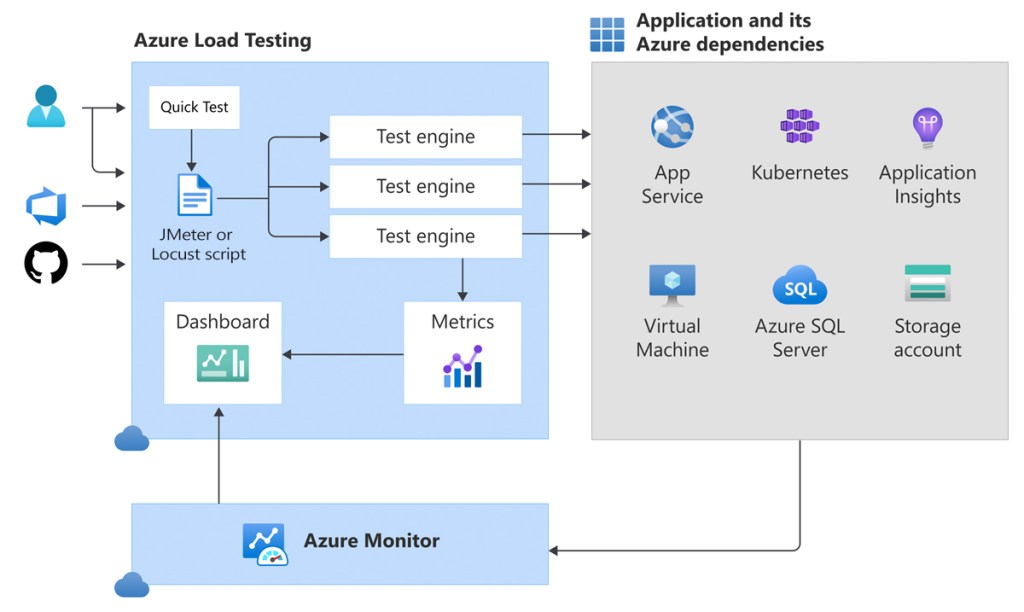
B. Server-Side Metrics (from Azure Monitor)
These metrics provide insight into the health and performance of the Azure resources supporting your application. This is where you identify the root cause of performance issues.
- CPU Utilization (%):
- Analysis: If the CPU on resources like App Service instances, Virtual Machines (VMs), or your Database consistently hits 80-100%, it’s a clear sign of a compute bottleneck. Your application or database needs more processing power.
- Memory Usage (%):
- Analysis: High memory usage (near 100%) can lead to swapping to disk, significantly degrading performance. Consider increasing memory or optimizing your application for lower memory consumption.
- Database Metrics (DTU/CPU/IO):
- Analysis: For Azure SQL Database, monitor metrics like DTU/CPU percentage, concurrent connections, and long-running queries. Maxing out these metrics indicates the database is the bottleneck. Solutions may include query optimization, adding indexes, or scaling up/out your database tier.
- Network In/Out (Bytes/sec):
- Analysis: High network utilization can point to issues with transferring large amounts of data or inefficient API calls between services.
Correlation Principle: The golden rule for performance analysis is: when you observe a degradation in any Client-Side metric (e.g., increased response time), immediately check the corresponding Server-Side metrics at the same time to see which resource is hitting its limits. For example:
- If response time increases and your App Service CPU hits 100%, the web app or its code is the bottleneck.
- If response time increases and your SQL Database DTU hits 100%, the database is the bottleneck.
- If both are stable, the issue might lie with external services (third-party APIs) or other architectural components.
2. Configuring and Optimizing Test Engine Instances
Test Engine Instances are the virtual machines Azure Load Testing uses to run your JMeter script and generate load. Properly configuring the number of instances is crucial for the scale and accuracy of your test.
A. Number of Test Engine Instances (Virtual Machines)
- Definition: This is the number of virtual machines (load generators) that will be provisioned in Azure to execute your JMeter script in parallel.
- Maximum Load per Instance: Each Test Engine Instance can generate a certain amount of load. While there’s no fixed ideal number (as it depends on your JMeter script’s complexity and resource consumption), a general guideline is:
- Each instance can support up to approximately 250 virtual users for complex JMeter scripts (multiple requests, data processing).
- For simpler scripts (just 1-2 requests), an instance might handle around 500-1000 virtual users or more.
- Formula (Estimation):
Number of Instances = CEILING(Total Required Virtual Users / Estimated Max Virtual Users per Instance)- Example: If you want to simulate 2000 virtual users with a medium-complexity script (estimating 200 users/instance), you’d need
CEILING(2000 / 200) = 10test engine instances.
- Configuration: You configure this number in the “Configure Load” section when creating or editing a test in the Azure Load Testing portal.
B. Cost and Performance Optimization of Test Engines
- Start Small, Scale Gradually (Incremental Scaling): Always begin with a low number of instances (e.g., 1-2) and increase them as you raise the number of virtual users. This helps you:
- Understand the actual limits of each instance with your specific script.
- Manage costs effectively by avoiding unnecessary resource allocation.
- Monitor Test Engine Resource Utilization: Azure Load Testing also provides metrics on the Test Engine Instances themselves.
- If the CPU/Memory of your test engines consistently hits high levels (e.g., >80%), it means your load generators are the bottleneck, not your application. You’ll need to increase the number of test engine instances to truly generate your desired load.
- Conversely, if the CPU/Memory of the test engines is consistently low, you might be paying for more instances than are necessary.
3. Viewing and Customizing Detailed Reports
The Azure Load Testing dashboard offers a powerful interface for visualizing your test data.
A. Test Run Dashboard Overview
After a test run completes, you’ll see an overview of:
- Summary: Provides key figures like run duration, status (Passed/Failed), total requests, total errors, average response time, and total throughput.
- Graphs: Real-time trend charts of key metrics (Active Users, Response Time, Throughput, Errors).
- Test Criteria: Shows the Pass/Fail assessment based on the criteria you defined.
- Top 5 Errors: Lists the most common errors encountered during the test, helping you quickly identify major issues.
B. Customizing Charts for Deeper Analysis
This is a powerful feature that allows you to tailor the data display to your analytical needs.
- Navigate to the “Dashboard” tab: Within the details of a completed test run.
- Click “Configure charts”: Usually found in the top-right corner of the charts section.
- Add/Remove Metrics:
- You can drag and drop metrics from the “Client-Side Metrics” and “Server-Side Metrics” lists onto existing charts or create new charts.
- Example: Add P90, P95, P99 to the “Response time” chart to see the latency distribution.
- Drag and drop CPU metrics of your App Service and DTU of your Database onto the same chart for easy correlation.
- Adjust Time Aggregation:
- You can change the granularity of the data on the chart (e.g., “Auto,” “5s,” “1m,” “5m”).
- “Auto” is the default.
- “5s” (5 seconds): Provides the most detailed view, useful for spotting micro-spikes or short-lived events.
- “1m” (1 minute): Helps smooth out minor fluctuations and see longer-term trends more clearly.
- Filter Data:
- You can filter the data displayed on the charts by various criteria:
- By JMeter Sampler Name: If your JMeter script has multiple requests (e.g., “Homepage Load,” “Login API,” “Add To Cart”), you can filter to view the performance of a specific request.
- By Test Engine Instance: See if performance issues are localized to specific load generators.
- You can filter the data displayed on the charts by various criteria:
- Split Charts:
- Use the “Split by” option (e.g., “Split by Test engine instance”) to display the same metric separately for each component (e.g., response time per engine, or CPU per App Service instance). This is useful for detecting localized anomalies.
- Save Chart Configuration: Once you’ve customized your chart view, you can save this configuration for future test runs or share it with your team.
4. Accessing Raw Data for Advanced Analysis
For even deeper analysis or integration with other Business Intelligence (BI) tools, you can access and export the raw test data.
A. Download Test Run Results
- How to: On the dashboard of a completed test run, you’ll see a “Download results” button.
- Content: This action will download a
.zipfile containing:.jtlfile: This is the raw JMeter Test Log file. It contains granular details of every single request sent, including response time, status, size, and more.- JMeter logs: Log files from the JMeter engines, useful for debugging script issues.
- Other configuration files.
- Analysis with JMeter GUI: You can open this
.jtlfile using the JMeter GUI (by adding a “View Results Tree” or “Aggregate Report” listener to a blank test plan in JMeter) to perform detailed offline analysis of individual requests or view aggregate reports that JMeter provides.
B. Accessing Raw Metrics (via Azure Monitor)
All server-side metrics collected by Azure Load Testing are stored in your Azure Monitor’s Log Analytics Workspace (if you’ve configured monitoring for your Azure resources). This powerful integration allows you to query the raw data using Kusto Query Language (KQL).
- Steps:
- In the Azure Portal, navigate to the Azure resource you monitored (e.g., App Service, SQL Database).
- In the left-hand menu of the resource, under “Monitoring,” click on “Logs”.
- You can use KQL to query relevant metrics. For example:
- To see the CPU utilization of your App Service over a specific time range:Đoạn mã
insightsmetrics | where TimeGenerated > ago(1h) // Adjust time range as needed | where Name == "CpuUtilization" and Namespace == "azure.applicationinsights/components" // Or Namespace relevant to your resource type | summarize avg(Val) by bin(TimeGenerated, 1m), _ResourceId // _ResourceId to differentiate instances | render timechart - To see the average duration of specific requests (if you have Application Insights configured and sending request data):Đoạn mã
requests
| where client_Type == "Browser" // or any other condition to filter
| summarize avg(duration) by bin(TimeGenerated, 1m), name
| render timechart
- To see the CPU utilization of your App Service over a specific time range:Đoạn mã
- You can save these queries, export the results, or even pin them to Azure Dashboards to create custom, persistent reports and monitoring views.
C. Creating Custom Azure Workbooks / Dashboards
For highly interactive, customized, and persistent analysis, you can create Azure Workbooks or Azure Dashboards.
- Azure Workbooks:
- Provide a flexible canvas to create rich visual reports.
- You can combine text, KQL queries, charts, images, and interactive controls (like resource dropdowns).
- Highly useful for creating detailed performance overviews or deep-dive reports for specific load tests, pulling data from Azure Monitor, Application Insights, or custom log sources.
- Path: In Azure Portal -> Search for “Monitor” -> Select “Workbooks.”
- Azure Dashboards:
- Allow you to aggregate important information from across the Azure Portal (including charts from Azure Monitor, Log Analytics query results) into a single, personalized dashboard.
- Excellent for tracking the overall performance health of your application post-deployment and load testing.
- Path: In Azure Portal -> “Dashboards.”
Conclusion
Mastering data analysis from Azure Load Testing is key to transforming load testing from a time-consuming activity into a powerful tool for performance improvement. By diving deep into client-side and server-side metrics, understanding their correlation, and leveraging Azure’s reporting and customization options, you can accurately identify bottlenecks, make data-driven optimization decisions, and ultimately build robust and highly scalable applications.
Integrating these advanced analytics into your development workflow ensures that performance remains a top priority, delivering an exceptional user experience.