


Introduction
One of Angular’s biggest strengths is how it keeps component styles isolated, preventing accidental leaks into the rest of the application. This makes large apps easier to maintain — but what happens when you actually need styles to cross component boundaries?
For example:
- applying a global theme,
- customizing a child component’s button, or
- overriding styles from Angular Material.
These scenarios are common in real projects, and they require techniques that go beyond the default encapsulation model. In this article, we’ll explore different ways to achieve cross-component styling in Angular, along with their pros, cons, and best practices.
A Common Styling Problem
Imagine you have a parent component that uses a child component like this:
<app-child></app-child>Inside the child component, there’s a simple button:
<!-- child.component.html -->
<button>Click me</button>
Now, suppose the parent wants to change that button’s background color to red. With Angular’s default encapsulation (Emulated), the parent’s CSS won’t affect the child’s button — the style is blocked by the component boundary:
/* parent.component.css */
button {
  background-color: red; /* ❌ Won’t apply inside child component */
}
This is where cross-component styling techniques come into play.
Solutions for Cross-Component Styling
There are several ways to style across component boundaries in Angular. Each has its use cases and trade-offs.
1. CSS Variables (Scoped & Global)
CSS custom properties (–var) cascade naturally through the DOM and are one of the most flexible approaches for theming. You can define them globally or scoped to a component.
a) Scoped with :host
Define variables at the parent’s host element so they apply only inside its subtree:
/* parent.component.css */
:host {
  --btn-bg-color: pink;
}
Grandchild styles can then consume these variables:
/* child.component.css */
button {
  background-color: var(--btn-bg-color, green);
}
b) Global with :root
Define variables globally so they’re available application-wide:
/* styles.css */
:root {
  --btn-bg-color: red;
}

/* grand-child.component.css */
button {
  background-color: var(--btn-bg-color);
}
✅ Clean and modern approach.
✅ Ideal for theming and dark mode.
⚠️ Requires child components to be written with variables in mind.
💡 Note on cascading: CSS variables follow the normal cascade rules.
- If a variable is defined at multiple levels (e.g., :root, parent, grandparent), the closest definition in the DOM tree overrides the global one.
- Example: if both :root and :host define –button-bg, the child will use the value from :host.
2. :host-context (Theme Switching)
/* grand-child.component.css */
:host-context(.dark) button {
  background-color: #333;
  color: #eee;
}
If the parent (or higher up, even <body>) adds the .dark class, the grandchild adapts automatically. No binding is required in Child or Grandchild.
3. ::ng-deep (Last Resort, Pierce Encapsulation)
/* parent.component.css */
:host ::ng-deep app-grand-child button {
  background-color: crimson;
}
✅ Works even if Child/Grandchild have no variable support.
⚠️ Deprecated; keep for overriding library components or quick fixes.
Example: Parent vs. Grandchild Rule
Consider this setup:
Grandchild CSS
/* grand-child.component.css */
:host-context(.dark) button {
  background-color: teal;
}
Parent CSS
/* parent.component.css */
:host ::ng-deep app-grand-child button {
  background-color: crimson;
}
DOM
<app-parent>
  <app-child class="dark">
    <app-grand-child>
      <button>Click me</button>
    </app-grand-child>
  </app-child>
</app-parent>
If the .dark class is applied on the child, the grandchild’s :host-context rule will override the parent’s ::ng-deep style, and the button will be teal.
Why does the grandchild rule win?
1. Specificity
- Grandchild’s rule uses .dark (class) + button (type) → specificity (0,2,0).
- Parent’s rule uses button only → specificity (0,1,0).
- CSS picks the more specific selector, so the grandchild wins.
2. Scoped Attributes
Angular rewrites :host-context with additional host/encapsulation attributes (like [_nghost-g], [_ngcontent-g]). This makes the rule even more tightly bound to the grandchild.
3. Cascade
Even if both rules were equally specific, the rewritten attributes plus source order give the grandchild style priority.
👉 Key lesson: When you fight between parent ::ng-deep and child :host-context, the child usually wins because its rule is more specific and scoped to its own template. If you truly need parent control, prefer CSS variables or carefully increase specificity.
4. Using Global Styles
You can define styles in styles.css (the global stylesheet) or set the parent component’s encapsulation to None:
/* styles.css */
app-child button {
  background-color: red;
}
✅ Simple, applies everywhere.
⚠️ Risky if overused — global styles can cause conflicts.
5. Using Component Inputs
Instead of forcing styles from the outside, you can pass style-related values into the child via @Input:
// child.component.ts
@Input() buttonColor: string = 'blue';

<!-- child.component.html -->
<button [style.background-color]="buttonColor">Click me</button>

<!-- parent.component.html -->
<app-child [buttonColor]="'red'"></app-child>
✅ The Angular way — keeps styles flexible and components reusable.
⚠️ Requires child component to support customization.
👉 Each method works, but they fit different scenarios.
Continue the Previous Post – ViewEncapsulation
https://blog.nashtechglobal.com/angular-viewencapsulation-at-a-glance/
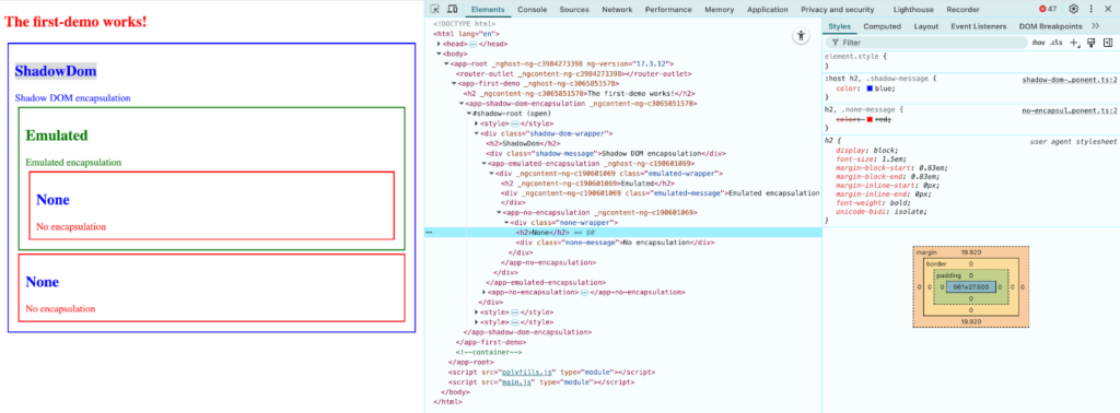
As seen in the earlier example, the <h2> elements of ShadowDomEncapsulationComponent and NoEncapsulationComponent are styled differently. The header in Shadow DOM appears red, while in Angular’s example it shows up blue.
You can easily fix this by using :host in Shadow DOM. But why does that work?
Since styles from ShadowDomEncapsulationComponent are added to the shadow host after the global styles, its h2 style overrides the global rule from NoEncapsulationComponent. The result is that the <h2> element inside the shadow component is colored blue rather than red — which may not be what the component’s author intended.
Best Practices for Cross-Component Styling
- Prefer Inputs and CSS Variables for Theming
Use @Input properties or CSS custom properties when you want components to be configurable and reusable. Example: pass a color or class name from parent to child, or define global theme variables like –primary-color. - Keep Global Styles Minimal
Reserve global styles (styles.css or ViewEncapsulation.None) for things like resets, typography, and theming. Avoid putting feature-specific styles into the global scope, as it leads to conflicts in large apps. - Use
::ng-deepOnly When Necessary
::ng-deep is handy for overriding styles in third-party libraries (like Angular Material), but since it’s deprecated, treat it as a last resort. If possible, prefer library-provided theming APIs over deep overrides. - Document Your Style Rules
If you rely on global CSS variables or theme definitions, keep them centralized and documented. This makes it easier for teams to maintain and extend styles consistently. - Balance Encapsulation with Flexibility
Don’t disable encapsulation (None) everywhere just for convenience. Use encapsulation defaults (Emulated) for most components, and only relax boundaries where theming or library overrides demand it.
👉 Following these practices ensures your Angular app stays maintainable, consistent, and scalable — without running into style conflicts.
Conclusion
Cross-component styling in Angular is often necessary for theming, customization, or working with third-party libraries. While Angular’s default encapsulation protects components from style conflicts, there are times when styles need to cross boundaries.
The key is to choose the right approach:
- Inputs and CSS variables for flexibility and clean theming.
- Global styles for resets and shared design rules.
::ng-deeponly as a fallback for library overrides.
By applying these techniques thoughtfully, you can keep your application’s styles both modular and adaptable, ensuring a consistent look and feel as your project grows.
Reference
- https://github.com/nnsan/angular/tree/main/misc/cross-component-styling