


When building Angular applications, UI development often takes more time than expected. Buttons, forms, validation states, layouts, spacing, and visual consistency can quickly become repetitive if everything is built from scratch. Over time, this not only slows development but also increases maintenance cost.
That’s where ng-zorro-antd (commonly called ng-zorro) becomes extremely useful. It is a comprehensive UI component library for Angular, built on top of the Ant Design system. In this article, we’ll walk through the fundamentals of ng-zorro so you can confidently start using it in your Angular projects.
This article focuses on basic usage and setup, laying a solid foundation before moving on to more advanced topics later.
What is ng-zorro?
ng-zorro-antd is the official Angular implementation of Ant Design, a design system originally created by Ant Group. Ant Design is well known for its clean visuals, clear hierarchy, and enterprise-friendly UX patterns.
ng-zorro provides a wide range of ready-to-use Angular components, such as:
- Buttons and icons
- Inputs, selects, and date pickers
- Forms with validation
- Tables, pagination, and lists
- Modals, drawers, and popovers
- Layout and grid components
All components are written specifically for Angular, meaning they integrate naturally with:
- Angular templates
- Reactive Forms
- Angular animations
- Change detection and dependency injection
Why Choose ng-zorro?
Before jumping into code, let’s look at why ng-zorro is commonly used in real-world Angular projects.
- Faster Development
Most common UI requirements are already solved. You don’t need to rebuild buttons, modals, or form layouts every time you start a new feature.
- Consistent Design Language
Ant Design enforces consistent spacing, typography, and color usage. Even when multiple developers work on the same project, the UI still feels unified.
- Ideal for Enterprise Applications
ng-zorro is widely used in dashboards, admin panels, internal tools, and management systems where clarity and usability are critical.
- Strong Documentation and Community
The official documentation provides live demos, API descriptions, and examples for nearly every component, making onboarding much easier.
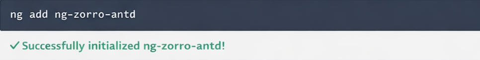
Installing ng-zorro in an Angular Project
If you already have an Angular project created with Angular CLI, installing ng-zorro takes only one command.
During installation, the CLI will prompt you with several options:
- Enable Angular animations
- Choose a theme
- Select a default language (i18n)
For most use cases, choosing the default options is perfectly fine, especially when you’re just getting started. After installation, the CLI automatically:
- Installs required dependencies
- Imports
BrowserAnimationsModule - Adds ng-zorro styles to
angular.json
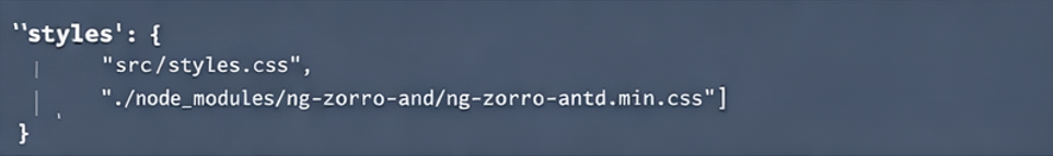
Verifying the Setup
Once installation is complete, it’s a good idea to verify that everything is configured correctly. Open angular.json and check that ng-zorro styles have been added. You should also see BrowserAnimationsModule imported in your root module.
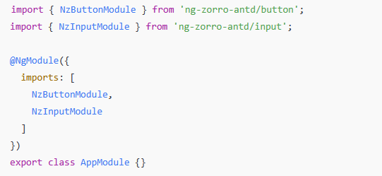
Understanding ng-zorro’s Modular Structure
One important concept in ng-zorro is its modular design. Instead of importing one large module, each component has its own dedicated module. For example:
- Buttons →
NzButtonModule - Inputs →
NzInputModule - Forms →
NzFormModule - Modals →
NzModalModule
This approach helps keep your bundle size smaller and makes your imports more explicit.
Using Your First ng-zorro Components
Now let’s move on to actually using some components.
Buttons
A basic ng-zorro button is very easy to create:
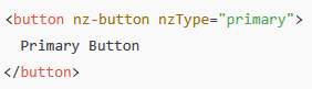
With just a few attributes, you already get:
- Consistent styling
- Hover and active states
- Proper padding and typography
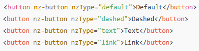
ng-zorro provides multiple button styles using the nzType attribute.
Working with Inputs
Inputs in ng-zorro follow the same philosophy: minimal setup with sensible defaults.
Basic Input

Without writing any CSS, the input already:
- Matches Ant Design styles
- Aligns visually with other components
- Supports focus and hover states
Inputs with Reactive Forms
ng-zorro works seamlessly with Angular Reactive Forms, which is essential for real-world applications.
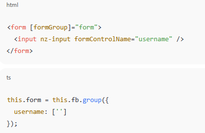
This allows you to handle validation, value changes, and form submission using standard Angular patterns.
Basic Layout Using ng-zorro Grid System
ng-zorro includes a flexible grid system built on rows and columns, making layout creation much easier.
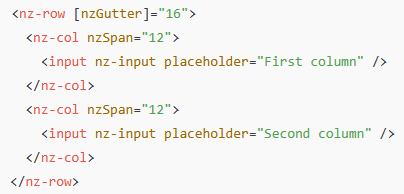
This approach helps you:
- Create responsive layouts
- Align elements consistently
- Avoid writing complex CSS flex or grid rules
Styling Philosophy: Configuration Over Custom CSS
One noticeable difference when using ng-zorro is how little custom CSS you need to write. In many cases:
- Spacing is handled by layout components
- Sizes and styles are controlled via component inputs
- UI consistency is maintained automatically
This is especially beneficial in larger teams, where design inconsistencies can easily creep in over time.
Common Beginner Tip
When starting with ng-zorro:
- Import only the modules you need
- Avoid overusing custom CSS early
- Rely on component APIs first before overriding styles
This will make your codebase cleaner and easier to maintain.
Wrapping Up
At this point, you should have a clear understanding of:
- What ng-zorro is and where it fits in Angular projects
- How to install and verify it correctly
- How its modular structure works
- How to use basic components like buttons, inputs, and grid layouts
This foundation prepares you for more advanced topics such as forms with validation, modals, tables, and real-world UI patterns, which naturally build on the concepts introduced here.