


In modern web development, building a UI component library is an essential aspect of creating maintainable and scalable applications which are built with React, Vue, and Flutter. However, designing, developing, and testing UI components can be a challenging task. That is why many developers have started to adopt tools like Storybook to handle these challenges. In this blog, we will explore six things to explore in Storybook to build a UI component library.
What is Storybook?
Storybook is an open-source tool that facilitates developers to build, document, and test UI components in an isolated environment. It provides a separate environment for developers to work on UI components, which allows them to focus on developing high-quality components without worrying about other parts of the application.
The document developed by Storybook consists of multiple stories, where the rendered state of UI components is stored. What is a story? A ‘story’ refers to a function that describes how to render the component.
5 key features of Storybook
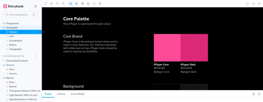
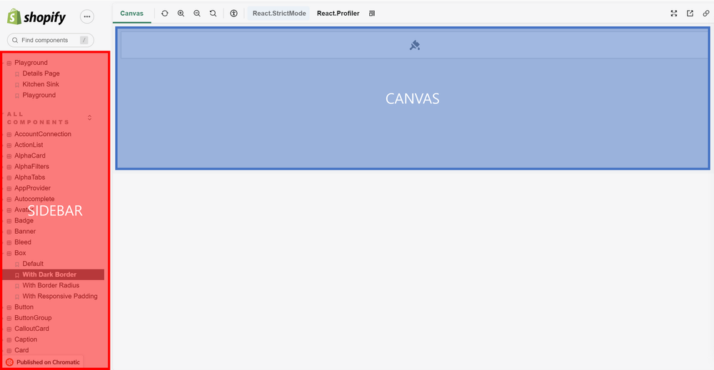
1. Story Browser
Storybook provides a sidebar and canvas to facilitate navigating stories. Sidebar consists of directories to stories, where developers can view UI components used in project.
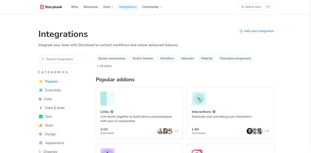
2. Add-ons
Storybook’s add-ons extend Storybook with features and integrations that are not built into the core. Features like documentation, accessibility testing, and interactive controls are examples of add-ons.
3. Customization
Stories in Storybook can be customized in several ways to make them more interactive and informative.
- Using Args: Args allow you to customize the props of a component in Storybook, and create variations of components, making stories more flexible and interactive. These can be reused in other stories and components.
- Using Parameters: Parameters allow you to add metadata to your stories. You can use parameters to control the behavior of various addons in Storybook. For example, you can use parameters to add a background color to your stories, control the behavior of controls, or set the viewport size.
- Using Decorators: Decorators allow you to wrap your component in arbitrary markup when rendering a story. You can use decorators to add a theme, layout wrapper, or context or data providers to your components. Decorators can also be used to add global styles, override component styles, or add animations to your stories.
- Using Addons: Addons are third-party tools that can be added to Storybook to enhance its functionality. Addons can be used to add interactivity to your stories, visualize your components, test your components, and more. Some popular add-ons include Actions, Knobs, Docs, and Viewport.
4. Testing
Storybook allows the testing of components in an isolated environment. Developers run Storybook locally and verify the appearance and behavior of every story. It’s also easy way for tester to verify the developed components.
5. Publishing
Storybook provides a way for teams to review and collaborate on UI components in progress. With the help of Storybook, developers can share UI components with other team members, designers, and stakeholders to verify the appearance of the UI without needing to access the code or a local development environment.