


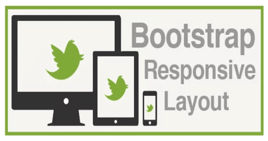
Introduction
Responsive images are a fundamental aspect of adaptation, and Bootstrap, a popular front-end framework, offers several tools and techniques to make this task more manageable. In this blog, we will explore the importance of responsive images, discuss Bootstrap’s features for handling them, and provide practical examples to help you implement responsive images effectively in your Bootstrap-powered projects.
The Importance of Responsive Images
Responsive images are essential for creating a seamless user experience across different devices. When web pages display images that are too large for a mobile device or too small for a high-resolution desktop monitor, users may encounter various issues, including slow loading times, distorted images, or content that is difficult to interact with.
By making images responsive, you ensure that they adapt to the user’s screen size and resolution, offering the best possible visual experience. This not only improves user satisfaction but also positively impacts SEO rankings, as search engines favor mobile-friendly websites.
Bootstrap and Responsive Images
Bootstrap is well-equipped to handle responsive images. It provides a range of features and classes to help you create adaptive designs effortlessly.
1. Image Classes
Bootstrap offers a set of image classes that you can apply to your <img> elements to make them responsive. These classes automatically scale your images based on the device’s screen size. The primary classes include:
.img-fluid: This class makes an image responsive by setting its maximum width to 100% and allowing it to scale down when necessary.
Example:
<img src="image.jpg" alt="Responsive Image" class="img-fluid">
2. img-thumbnail Class
The img-thumbnail class adds a subtle border and padding to your image, giving it a polished look. While it doesn’t inherently make the image responsive, you can combine it with the img-fluid class to achieve both effects:
<img src="your-image.jpg" alt="Thumbnail Image" class="img-fluid img-thumbnail">
This combination maintains the image’s responsiveness while adding an attractive border.
3. Responsive Breakpoints
Bootstrap utilizes responsive breakpoints, defined by CSS media queries, to control how images behave on different screen sizes. By default, Bootstrap includes four breakpoints: sm, md, lg, and xl. You can use these breakpoints to specify different image sizes for various screen sizes.
Example:
<img src="small.jpg" alt="Small Image" class="img-fluid d-sm-none d-md-block">
<img src="large.jpg" alt="Large Image" class="img-fluid d-none d-md-block">
In this example, the first image will be hidden on small screens (sm), while the second image will only be displayed on medium-sized screens (md) and above.
4. Image Srcset
Bootstrap also supports the HTML srcset attribute, which allows you to provide multiple image sources with different resolutions. Browsers can then select the most appropriate image based on the user’s device capabilities.
Example:
<img srcset="image-320w.jpg 320w, image-640w.jpg 640w, image-1280w.jpg 1280w" sizes="(max-width: 320px) 280px, (max-width: 640px) 600px, 1200px" src="image-640w.jpg" alt="Responsive Image">
In this example, the browser will choose the image that best matches the user’s screen width and resolution.
Conclusion
Responsive images are a crucial aspect of modern web design, ensuring that your content looks great on all devices. Bootstrap simplifies the process of creating responsive images with its built-in classes, responsive breakpoints, and support for the srcset attribute. By implementing these features effectively, you can provide a consistent and visually appealing experience to your website’s users, regardless of the device they use.
Finally, for more such updates and to read more about such topics, please follow our LinkedIn page Frontend Competency