


Introduction
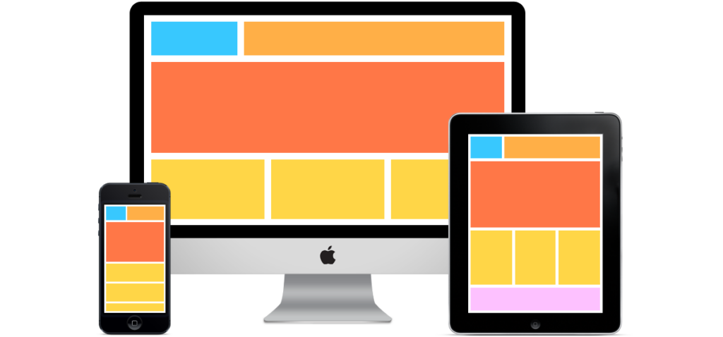
In today’s era, web content is accessed across a multitude of devices and screen sizes, ensuring that images look great. This is where responsive images come into play. Responsive images, when implemented using CSS techniques, enable web developers to provide tailored image experiences to users regardless of their device or viewport size. In this blog, we’ll delve into the world of responsive images and explore various CSS techniques to optimize image display across different devices.
Understanding Responsive Images
Responsive images are images that dynamically adjust their size and resolution to fit different screen sizes and resolutions. This ensures that users get an optimal viewing experience, whether they’re using a smartphone, tablet, laptop, or desktop computer. Without responsive techniques, images might be too large and slow to load on smaller screens, or they could be too small and lose detail on larger screens.
CSS Techniques for Responsive Images
1. Viewport Units
CSS offers viewport-relative units like vw (viewport width) and vh (viewport height). You can use these units to set the maximum width of an image, ensuring it scales down proportionally as the viewport size decreases.
img {
  max-width: 100%;
  height: auto;
}
2. Media Queries
Media queries allow you to apply different styles based on the characteristics of the device. You can use them to adjust image sizes at specific breakpoints, ensuring images look their best across various screen sizes.
@media (max-width: 768px) {
  img {
    max-width: 80%;
  }
}
3. Image Replacement with CSS Backgrounds
For more complex scenarios, where you need to change an image’s source based on the viewport size, you can use CSS backgrounds along with media queries. This technique is useful when you want to display different images or icons for different screen sizes.
@media (max-width: 480px) {
  .header-logo {
    background-image: url('logo-small.png');
  }
}
4. CSS Flexbox and Grid for Image Layout
CSS Flexbox and Grid layouts provide powerful tools for creating responsive image galleries or arranging images within a container. These layout systems ensure that images adjust their positions and sizes automatically based on available space.
.image-gallery {
  display: grid;
  grid-template-columns: repeat(auto-fill, minmax(250px, 1fr));
  gap: 10px;
}
Optimizing Images for Performance
Responsive design isn’t just about adjusting image sizes; it’s also about optimizing image loading for better performance. Here are a few tips:
1. Image Formats
Choose the appropriate image format. Use JPEG for photographs and PNG or SVG for images with transparency or simple graphics.
2. Image Compression
Compress images to reduce file sizes without sacrificing quality. Tool like Squoosh can help with this.
3. Lazy Loading
Implement lazy loading to load images only when they come into the user’s viewport. This technique speeds up initial page load times.
Conclusion
Using responsive images using CSS is a fundamental skill for modern web development. By leveraging techniques like viewport units, media queries, CSS layout tools, and attribute-based solutions like srcset, you can create web pages that adapt gracefully to a variety of devices and screen sizes. This not only enhances the user experience but also contributes to faster load times and better overall performance.
Finally, for more such updates and to read more about such topics, please follow our LinkedIn page Frontend Competency