


Introduction
One of the essential factors in internet layout is typography, and responsive typography performs a pivotal role in developing a continuing and consumer-friendly surfing enjoy. In this weblog, we’re going to discover the concept of responsive typography in CSS and how you can enforce it to make your internet site text look exquisite on any tool.
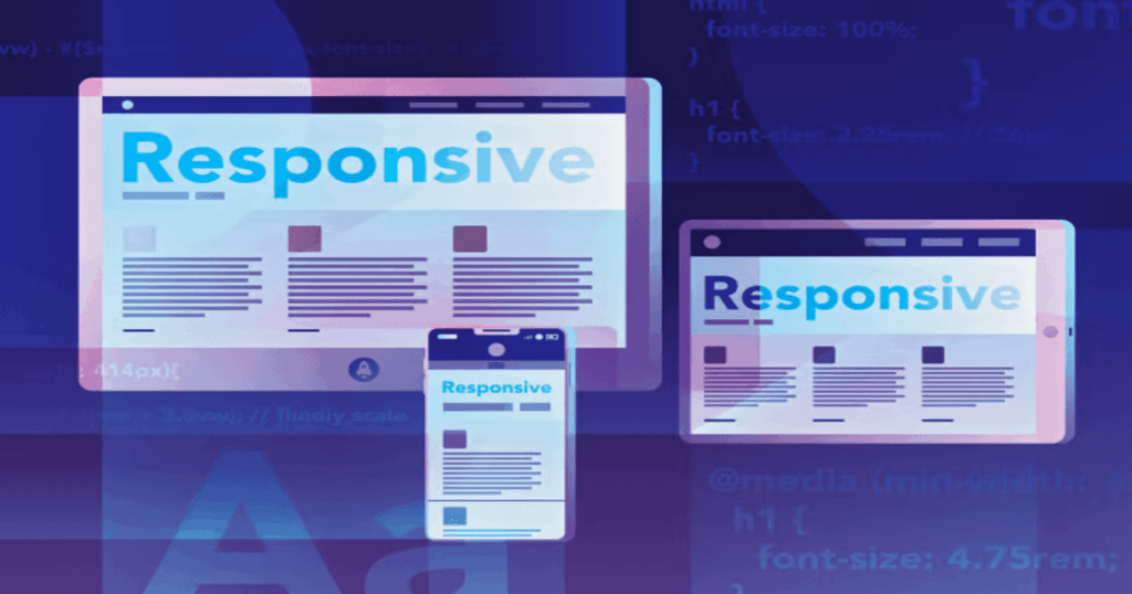
Understanding Responsive Typography
Responsive typography is the artwork of adapting your internet site’s text to specific display sizes and orientations at the same time as keeping clarity. It ensures that your content remains available and visually captivating, whether considered on a desktop pc, a pill, or a cellphone. The intention is to create a harmonious relationship between text and the screen, adjusting font size, line spacing, and other typographic elements dynamically.
Key Principles of Responsive Typography
To achieve responsive typography, you need to follow some key principles:
1. Relative Units
Instead of using fixed pixel sizes for fonts, use relative units like percentages, ems, or rems. These units scale with respect to the parent element, making text adapt to the container’s size.
body {
  font-size: 100%; /* 100% is the default size */
}

h1 {
  font-size: 2.5em; /* Relative to the parent font size */
}
2. Fluid Typography
Implement fluid typography by defining font sizes with viewport units (vw, vh, vmin, vmax). This allows text to scale based on the width or height of the viewport.
h2 {
  font-size: 4vw; /* 4% of the viewport width */
}
3. Media Queries
Use media queries to adjust typography for different screen sizes and orientations. This allows you to fine-tune your typography at various breakpoints.
@media (max-width: 768px) {
  p {
    font-size: 16px;
  }
}
4. Line Height
Consider adjusting line height as the font size changes to maintain readability. A general guideline is to set line height to around 1.5 times the font size.
p {
  font-size: 18px;
  line-height: 1.5;
}
5. Font Families
Choose font families that work well across different devices and screen sizes. Web-safe fonts or custom web fonts loaded from services like Google Fonts are excellent choices.
body {
  font-family: "Helvetica", sans-serif;
}
Implementing Responsive Typography
Now that we’ve covered the principles, let’s see how to implement it in practice. Here’s a simple example:
/* Base font size for the entire document */
body {
  font-size: 16px;
  line-height: 1.5;
  font-family: "Helvetica", sans-serif;
}

/* Responsive typography using media queries */
@media (max-width: 768px) {
  body {
    font-size: 14px;
  }

  h1 {
    font-size: 2em;
  }
}

@media (max-width: 480px) {
  body {
    font-size: 12px;
  }

  h1 {
    font-size: 1.5em;
  }
}
With this approach, your website’s typography will adjust smoothly as the viewport size changes, ensuring a consistent and pleasant reading experience on various devices.
Conclusion
Responsive typography is an important thing of present day web design. By following the concepts of relative units, fluid typography, media queries, appropriate line heights, and font choices, you can create a website that appears brilliant and is simple to study on any screen. Remember that testing your typography on different gadgets is essential for achieving the exceptional results.
Finally, for more such updates and to read more about such topics, please follow our LinkedIn page Frontend Competency