


Introduction
In today’s digital landscape, where users access websites on a variety of devices, responsive web design has become an essential skill for web developers. Users expect websites to seamlessly adapt to different screen sizes, orientations, and devices, providing a consistent and user-friendly experience. This is where CSS media queries come into play. In this blog, we will explore the concept of responsive web design and delve into the power of CSS media queries.
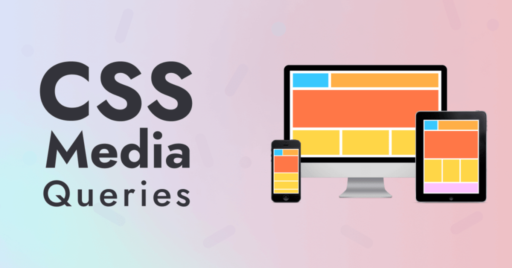
Understanding Responsive Web Design
Responsive web design is a design approach that ensures a website’s layout, images, and content adjust fluidly to accommodate different screen sizes and devices. The goal is to create a seamless and enjoyable user experience, whether someone is browsing on a desktop computer, tablet, or smartphone. Traditional fixed-width layouts can lead to a poor experience on smaller screens, resulting in content being cut off or users needing to zoom in to read text.
CSS Media Queries
CSS media queries are a crucial component of responsive web design. They allow you to apply different styles and rules based on various conditions, such as screen width, height, orientation, and even device capabilities. Media queries work by specifying a set of CSS rules that are applied only when the conditions defined within the query are met.
Syntax of Media Queries
Media queries in CSS follow a simple syntax. Here’s a basic example:
/* Styles for screens with a width up to 600px */
@media (max-width: 600px) {
  /* Your CSS rules here */
}
In this example, the styles within the media query will only apply when the screen width is 600 pixels or less.
Creating Responsive Breakpoints
To achieve a well-designed responsive website, you’ll need to define breakpoints strategically. Breakpoints are specific screen widths at which your design will adapt. Common breakpoints are often based on the widths of popular devices, such as smartphones, tablets, and desktop screens. For instance:
/* Styles for smartphones */
@media (max-width: 767px) {
  /* Adjust styles for smartphones */
}

/* Styles for tablets */
@media (min-width: 768px) and (max-width: 1023px) {
  /* Adjust styles for tablets */
}

/* Styles for desktop screens */
@media (min-width: 1024px) {
  /* Adjust styles for desktop screens */
}
By customizing your design at each breakpoint, you can ensure that your website looks and functions optimally on a range of devices.
Optimizing Images for Different Screens
Images play a crucial role in web design, and optimizing them for various devices is vital for responsive design. By using CSS media queries, you can serve different images based on the user’s screen size and resolution. This technique, known as “responsive images,” ensures that your website doesn’t load large images on small screens, reducing loading times and improving performance.
Testing and Debugging
Once you’ve implemented media queries, thorough testing which is vital. Use browser developer tools to simulate various devices and screen sizes, ensuring that your design looks great everywhere. Address any issues that arise, such as content overlap or unintended shifts in layout.
Conclusion
CSS media queries provide the foundation for creating websites that seamlessly adapt to different devices and screen sizes. By carefully designing breakpoints and adapting styles, you can create a website that shines on screens of all sizes.
Finally, for more such updates and to read more about such topics, please follow our LinkedIn page Frontend Competency