


Why Storybook?
Storybook is broadly used across teams to develop a consistent UI. This open source project brings design and engineering teams together to focus on organizing a perfect component library.
In effort to help users build accessible applications, Storybook released their accessibility add-on. The idea behind is to provide support for automated accessibility tests within Storybook to capture and surface accessibility errors. Solving these issues throughout the development process allows us to spend more time on manual testing.
How to add the accessibility add-on to Storybook
Storybook already comes with some essential addons, but unfortunately, these do not include the accessibility add-on, so we’ll have to install it as well.
npm install @storybook/addon-a11y
Then, need to create or add a main.js file inside the .storybook folder with the following:
//.storybook/main.js module.exports = {
addons: ['@storybook/addon-a11y']};
Testing our component
Let’s take a look at an example of a top navigation component.
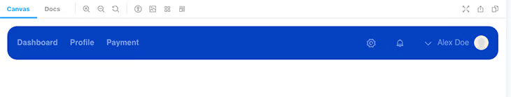
At first glance, the component looks ready to ship, but if we go into the accessibility tab, the tests tell us something different.
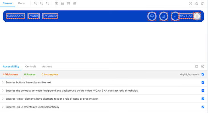
The navigation component is missing certain accessibility requirements, so axe enumerates four violations. The accessibility add-on comes with a Highlight results checkbox that helps identify the components that are failing. This can be very useful when dealing with larger components because it will save us from having to rerun these tests individually for each component.