


What is website responsiveness and how to test it?
Today, discovering what interests you takes just a few seconds. With the plethora of devices at our disposal—laptops, smartphones, tablets, and even smartwatches—we’re no longer tethered to desktop computers. Ensuring website responsiveness across these varied devices is crucial for business growth and expanding audience reach.
Responsive web design tackles common pitfalls such as incorrect resizing, cumbersome scrolling, awkward zooming, and misguided panning. One notable advantage of responsive design is the elimination of the need for a separate mobile website.
Addressing common queries regarding website testing, let’s delve into the details. You can find comprehensive answers in the blog, “Test Environment Management in Web Application Testing – Challenges and Solutions – NashTech Insights”.
There are three primary methods to test website responsiveness:
- Browser Developer Tools: Most modern web browsers offer built-in developer tools enabling simulation of diverse devices and screen sizes. For instance, in Chrome, access Developer Tools (Ctrl + Shift + I or Cmd + Opt + I on Mac), click on the device icon in the toolbar, and select from preset devices or customize screen dimensions. Detailed instructions are available in the blog, “Use Chrome DevTools for Web Application Testing – NashTech Insights”.
- Real Device Testing: While virtual testing is convenient, validating on real devices is crucial for an authentic user experience. Ensure testing across a spectrum of devices including smartphones, tablets, and various models.
- Online Responsive Design Testing Tools: Utilize specialized tools for comprehensive testing across devices and screen sizes. Our blog introduces “BrowserStack”, offering visual previews of your website on diverse devices.
“Why BrowserStack for responsive testing?” Find the answer in the blog, “Mobile Testing Challenges and BrowserStack Solutions – NashTech Insights”.
By employing these testing methodologies and leveraging tools like BrowserStack, you can guarantee seamless website performance across devices, enhancing user satisfaction and business growth.

How to use BrowserStack for web responsive testing?
BrowserStack is a tool that helps you see how your website will be displayed on different phone models, operating systems, and tablets on different types of browsers. You do not need to install Emulators to get the data.
List Of Real Browsers & Mobile Devices for Live Testing
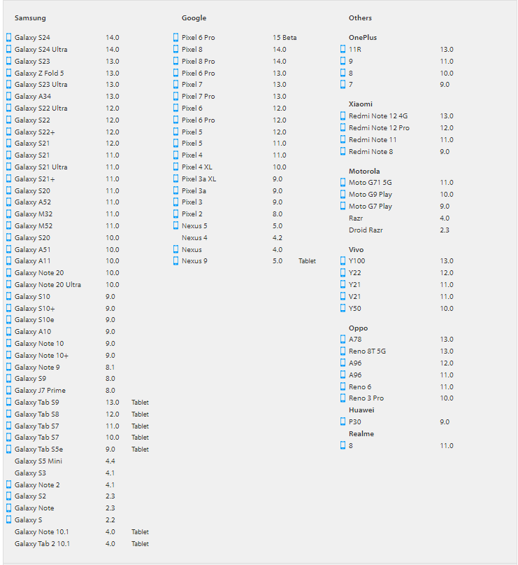
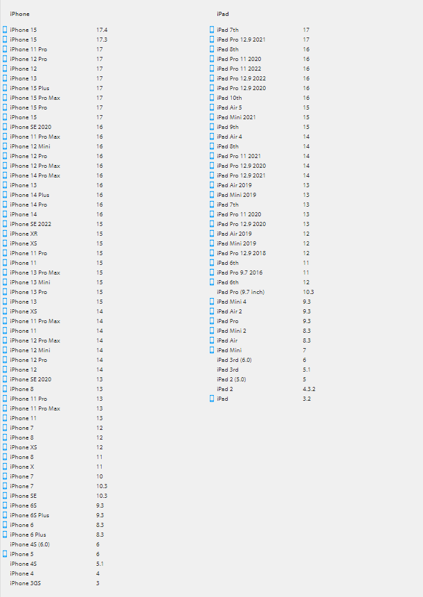
- List of Real Mobile & Tablet Devices
- For Android devices: Samsung (Mobile & Tablet devices), Google (Mobile & Tablet devices), OnePlus, Xiaomi, Vivo, Motorola, Oppo, Huawei, Realme.
-
- For iOS: iPhone and iPad with a lot of iOS version
- Responsive Design Testing on Browser
- For Windows: Edge, Firefox, Chrome, Opera, Yandex and Safari browsers.

-
-
- For Mac: Sonoma, Ventura, Monterey, Bug Sur, Catalina, Mojave, High Sierra, Sierra (with Safari , Firefox, Chrome, Opera, Yandex, Edge browsers) and Lion, Snow Leopard (with Safari, Firefox, Chrome, Opera browsers).
-

-
- Please refer to BrowserStack Web for more details: List of browsers
Steps By Steps To Test Responsive:
- Sign Up for BrowserStack: First, you’ll need to sign up for an account on the BrowserStack website. You can choose from different subscription plans based on your testing needs.

- Access the BrowserStack Dashboard: Once you’ve created an account and logged in, you’ll be directed to the BrowserStack dashboard.
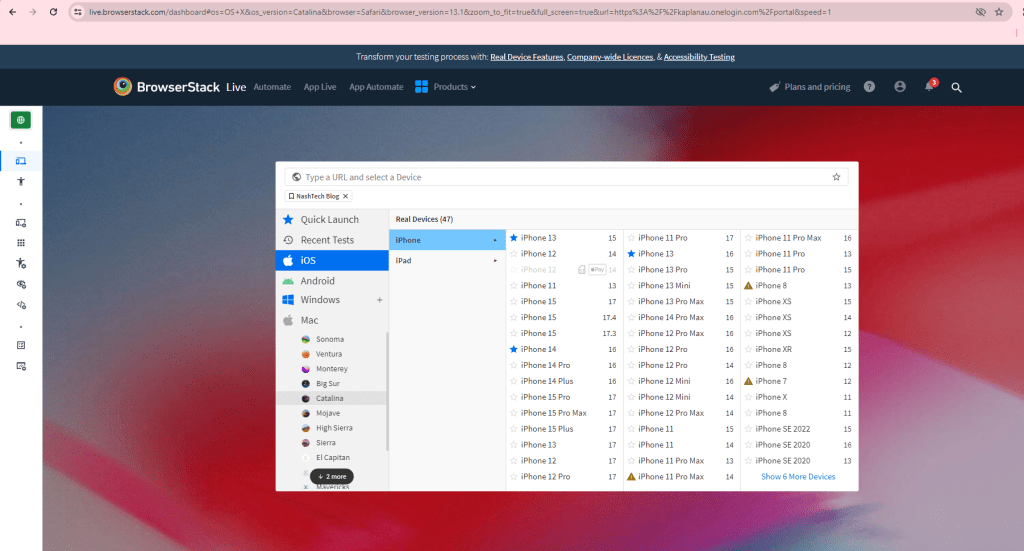
- Select the Device and Browser: In the dashboard, you’ll see options to choose the device, operating system, and browser combination you want to test your website on. BrowserStack offers a wide range of devices, browsers, and operating systems to choose from. You can based on test strategy or using your traffic analytics data to find the right devices.

- Enter Your Website URL: After selecting the desired device and browser combination, enter the URL of the website you want to test in the provided field. Or you can bookmark a URL, and add it to favorite to use for next time.
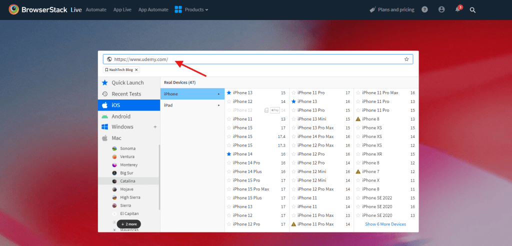
- Start the Testing Session: Select browser of device to initiate the testing session. BrowserStack will launch a virtual environment that replicates the selected device and browser configuration.

- Interact with Your Website: Once the testing session is started, you can interact with your website just like you would on a real device. You can navigate through different pages, click on links, fill out forms, and perform various actions to test the responsiveness and functionality of your website.
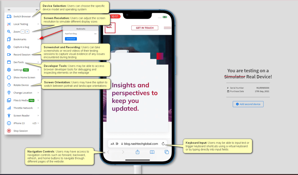
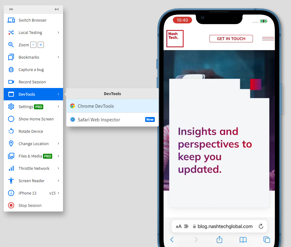
- Inspect and Debug: While testing, you can use browser developer tools or BrowserStack’s built-in debugging tools to inspect elements, debug issues, and analyze the performance of your website.
- Take Screenshots and Recordings: BrowserStack allows you to take screenshots and record videos of your testing sessions. This can be useful for documenting issues, sharing feedback with your team, or reviewing the overall user experience.


- Repeat for Different Devices and Browsers: To ensure comprehensive testing, repeat the above steps for different device and browser combinations. BrowserStack makes it easy to switch between configurations and conduct testing across a wide range of environments.

- Review and Analyze Results: After testing on multiple devices and browsers, review the results and analyze any issues or inconsistencies. BrowserStack provides detailed reports and insights to help you identify and address any compatibility or responsiveness issues.
By following these steps and leveraging BrowserStack’s capabilities, you can ensure that your website is responsive and functions seamlessly across various devices and browsers, ultimately enhancing the user experience.
Parallel Testing With BrowserStack
We can test across different browsers, devices, and operating systems, thereby accelerating your testing process and improving efficiency in a single tab.

Here is the steps:
- Access the BrowserStack Dashboard: same as single device
- Select the Device and Browser
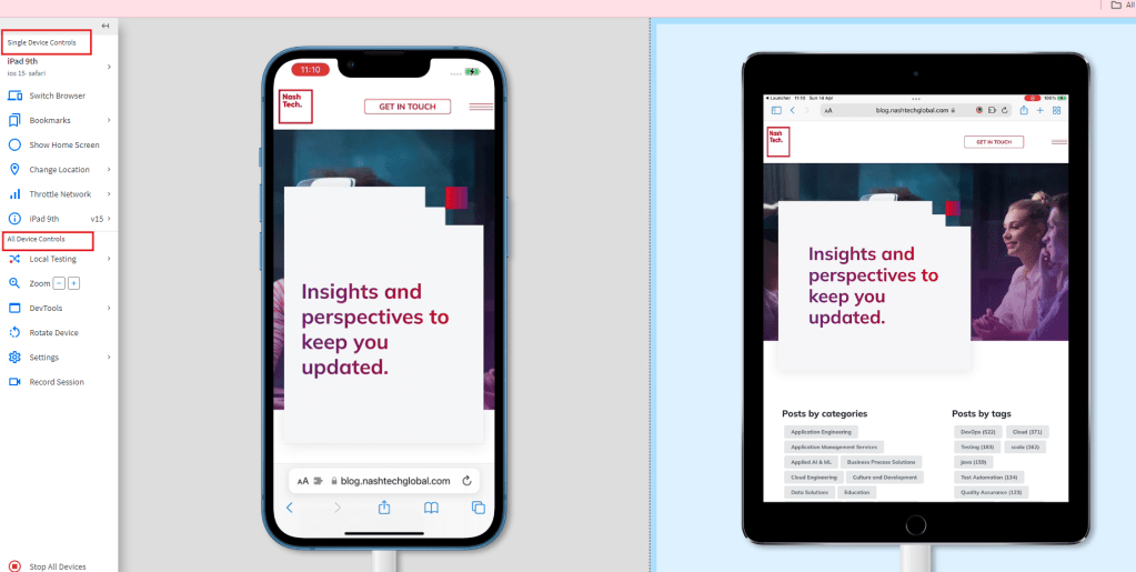
- Hover the cursor to the right side of the screen and click the + Add Device button.
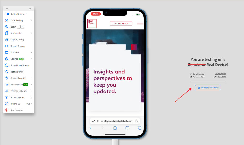
- Select another real device to replicate the same tests on both devices.
- Use the toolbar to perform more actions or close the sessions together.
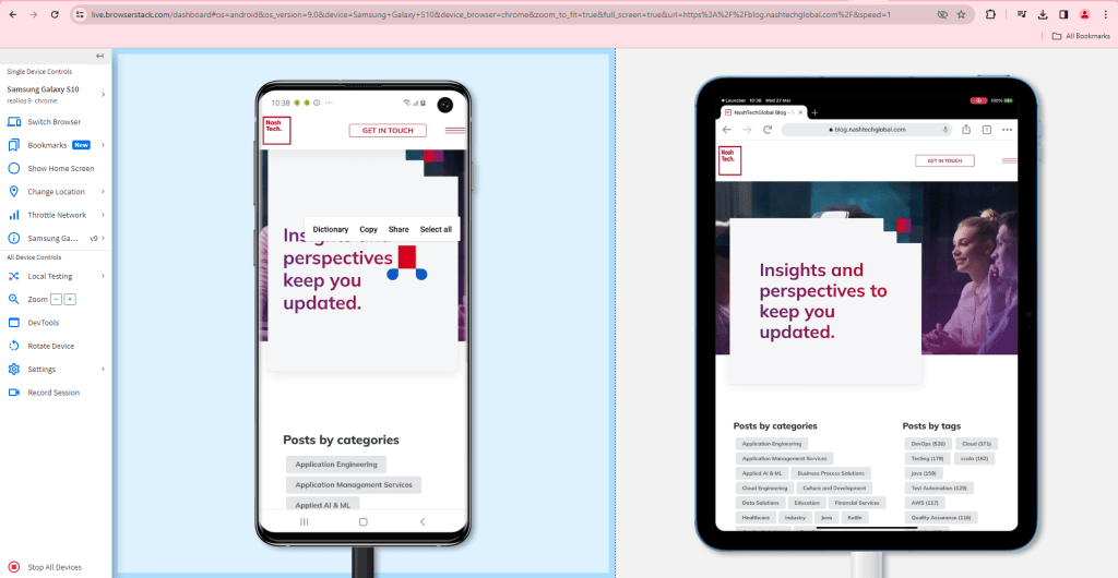
- Single Device Controls: These controls are the options that affect only the active device.
Active device is the currently selected device. It is also mentioned in the toolbar and is with the blue background. - All Device Controls: These controls are the options that affect all devices in the session.
- Single Device Controls: These controls are the options that affect only the active device.
Kindly consult the video recordings for additional information:
Conclusion
In conclusion, BrowserStack offers an invaluable solution for ensuring web responsiveness across various devices and browsers. By providing access to a wide range of real devices and browsers, BrowserStack enables comprehensive testing without the need for emulators. Users can leverage features such as parallel testing, interactive debugging tools, and detailed test reports to streamline the testing process and ensure optimal user experiences. With BrowserStack, developers and testers can confidently validate their websites’ responsiveness, leading to enhanced usability, customer satisfaction, and overall success in the digital landscape.